Feb 2023
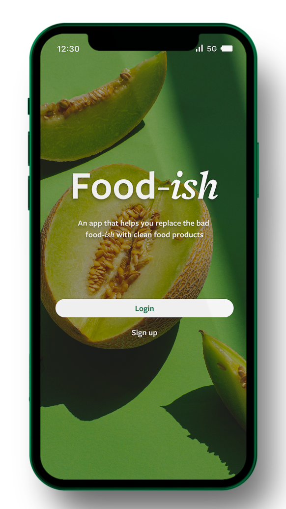
food-ish
ux/ui design | product design | brandingVideo walkthrough of the app!
About The Project
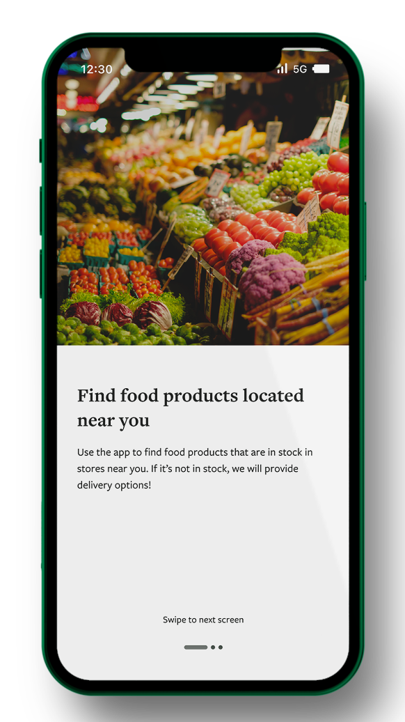
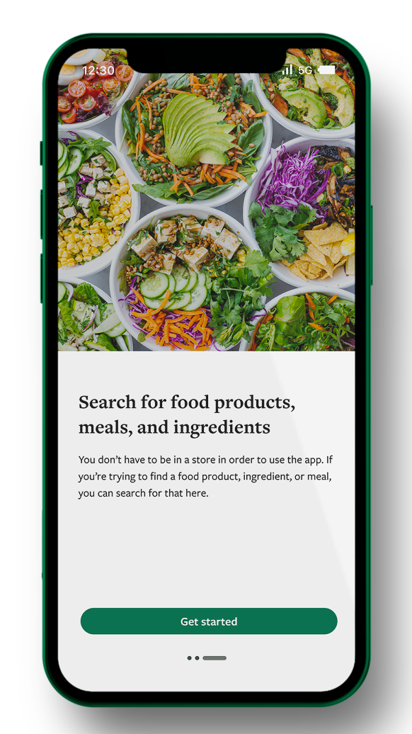
Food-ish is an app that focuses on providing users with the ability to understand the ingredients they are consuming on a day-to-day basis while also providing resources to find certain products in food-insecure areas. This type of app is so relevant today, especially considering we live in a country with some incredibly remote areas with minimal access to food while also having collectively poor food literacy.
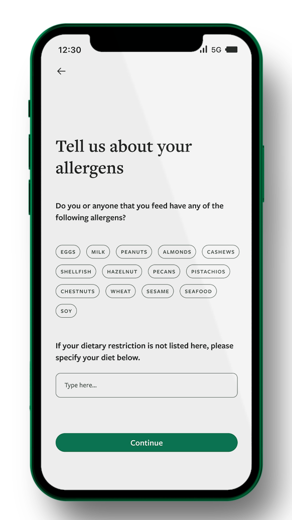
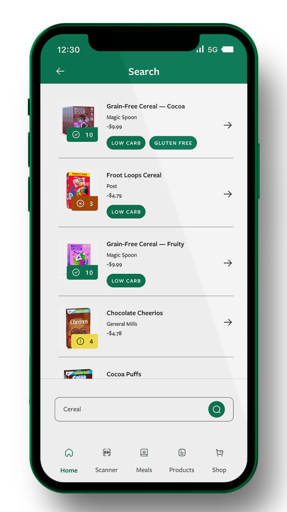
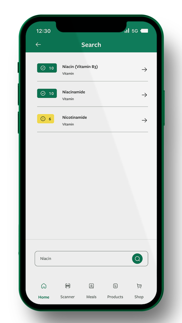
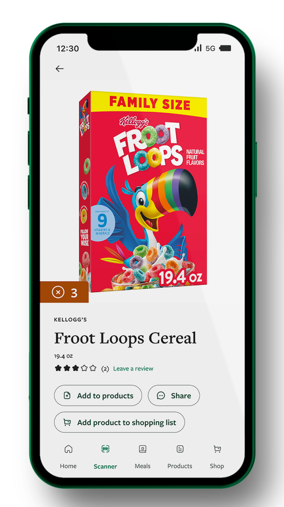
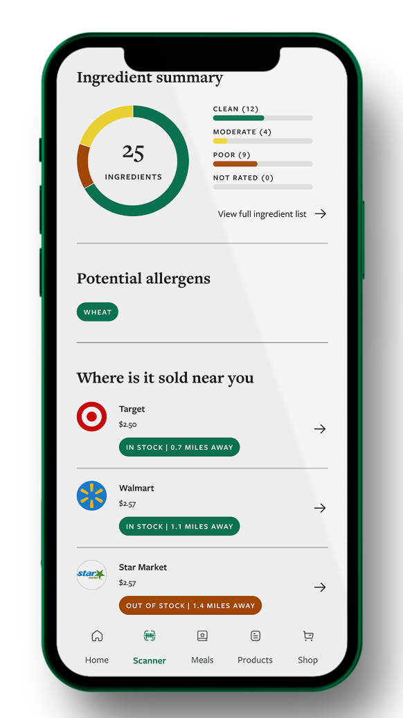
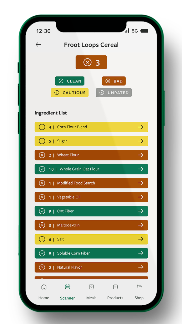
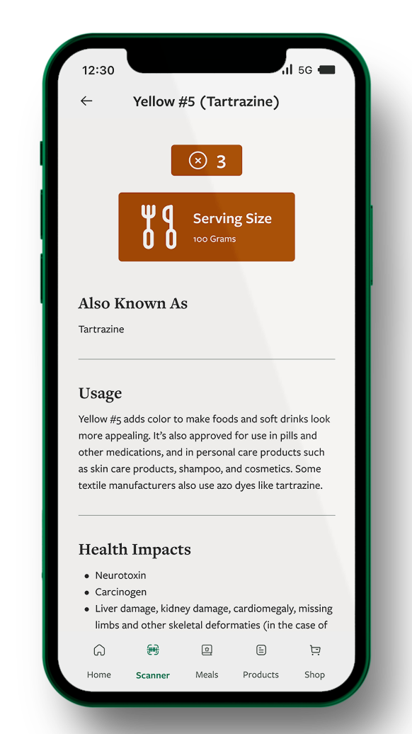
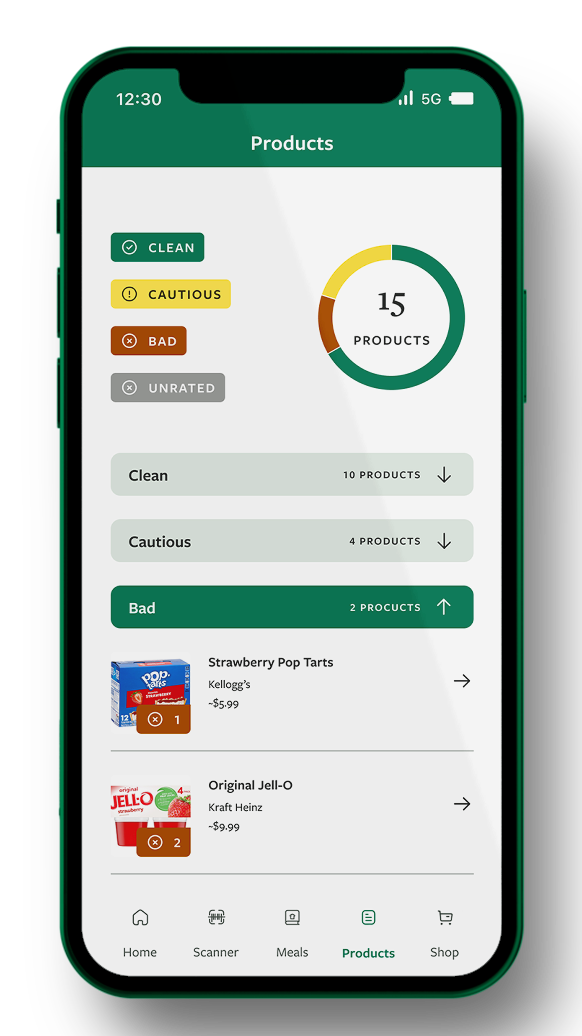
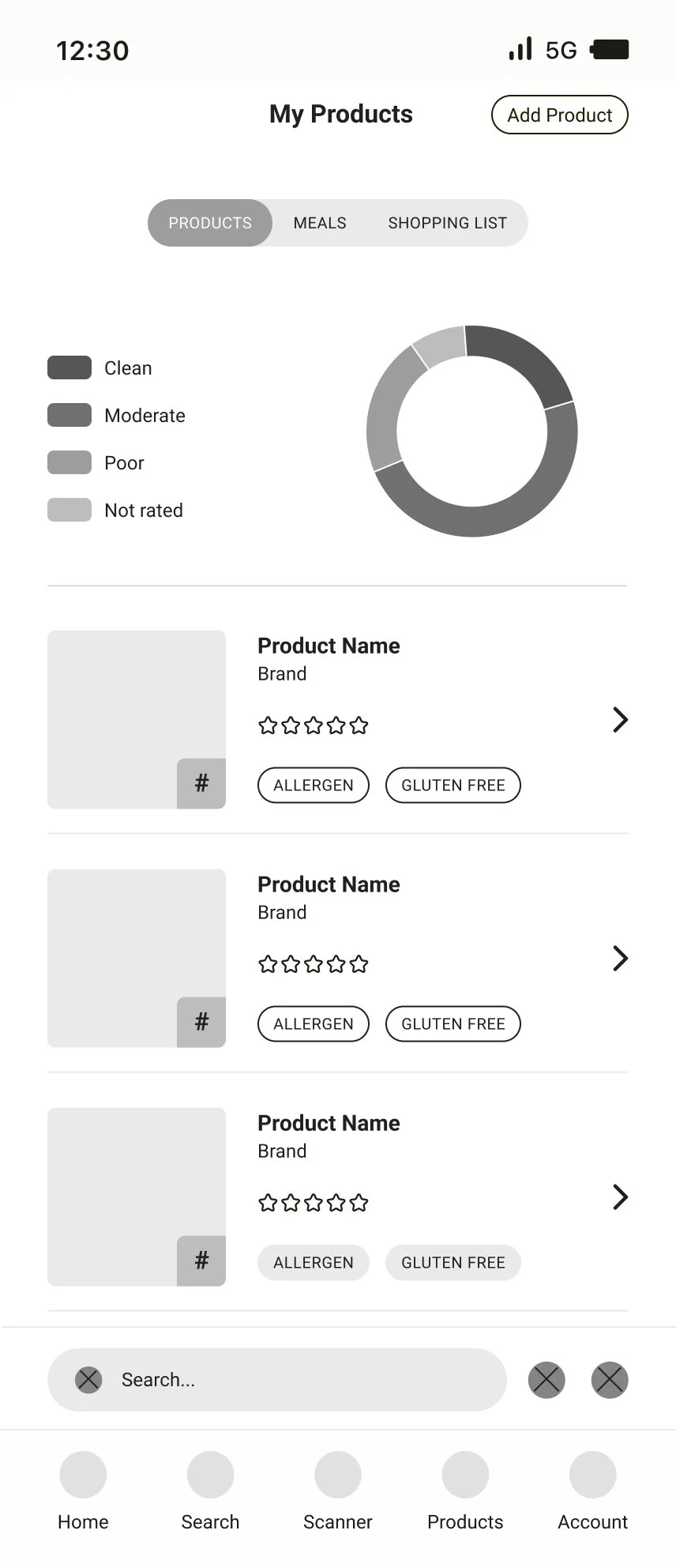
All products on the app are rated based on the quality of the ingredients. This is to help users better understand what ingredients are bad for them. The app is also responsive to dietary and allergen needs. The app doesn’t necessarily focus on foods that are considered health or unhealthy, but instead it focuses on clean or not clean products. A “clean” product is a product that has been shown to have no adverse side effects, and an “unclean” product has ingredients that do cause adverse side effects.
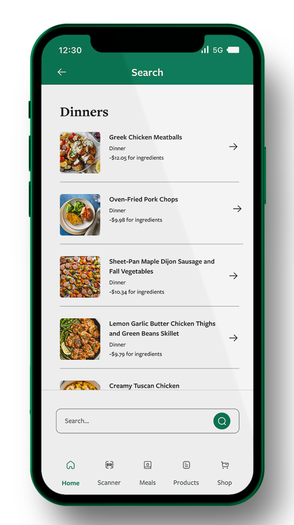
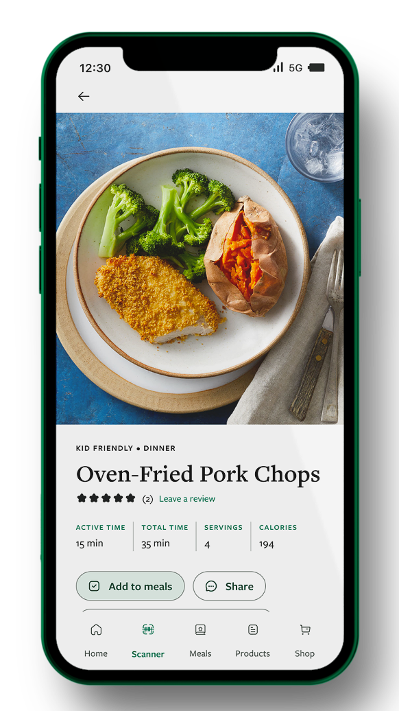
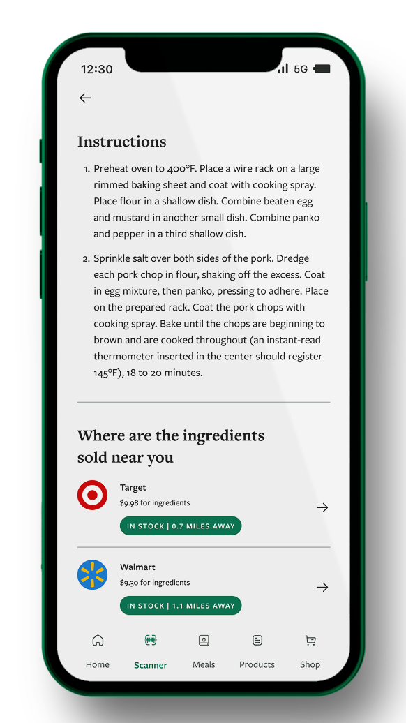
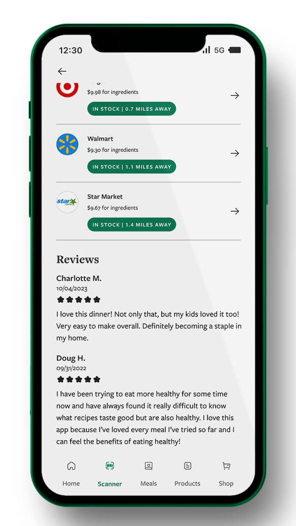
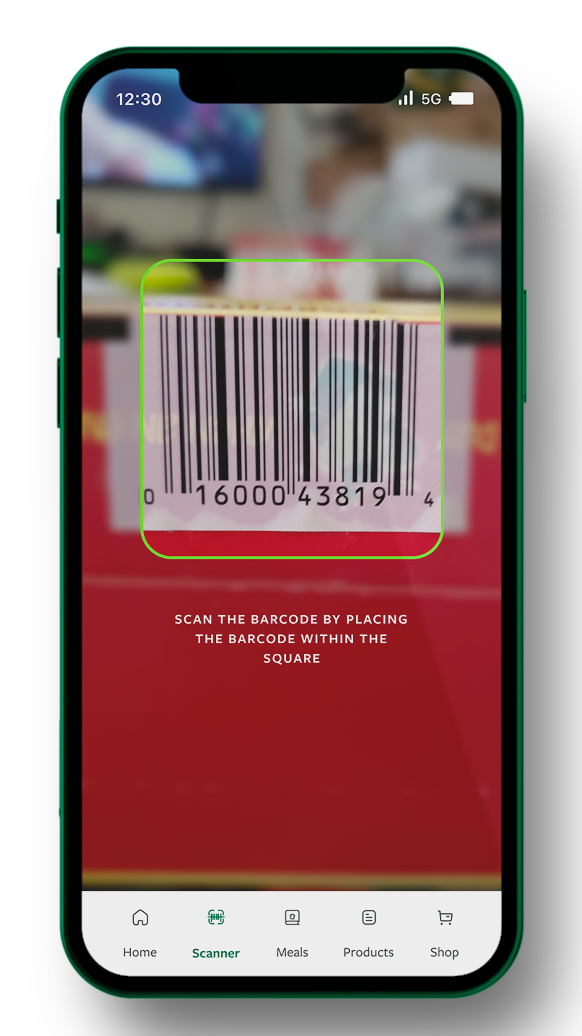
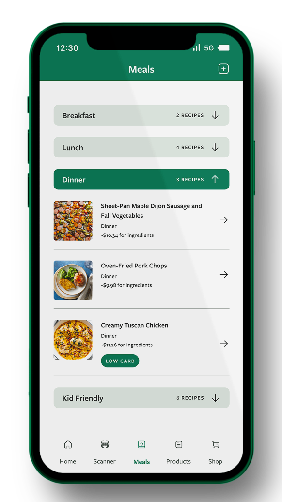
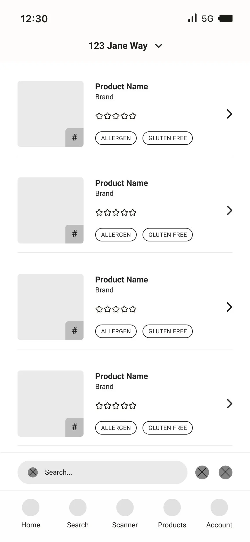
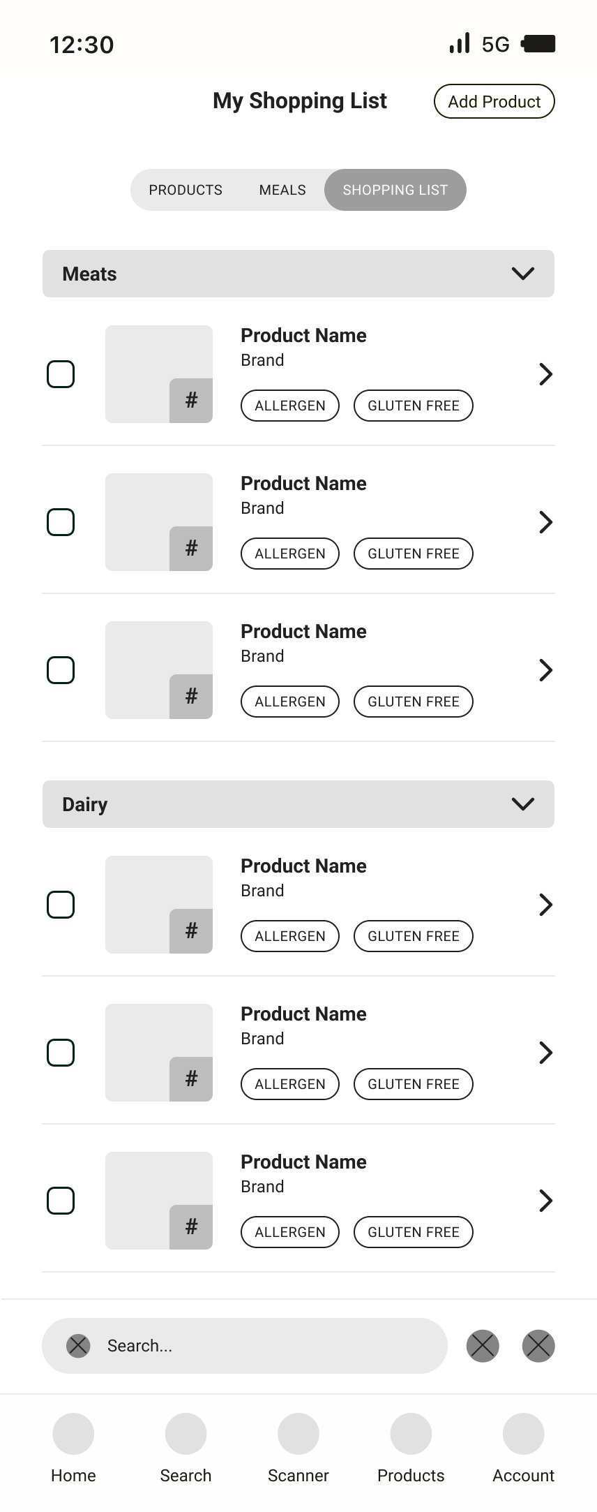
The barcode scanning features allows for easy in-store assessment of food products. The app also provides the ability to see if products are in stock locally to you, and if they aren’t, the app provides a link to buy it online or offers alternative recommendations for the product. Additionally, preplanned meals are a staple of the app, and can easily be added to the built in shopping list that can also include various other products.
Project outline
Problem: Low income Americans statistically have higher rates of food insecurity and food illiteracy, meaning they don’t understand how to read a nutrition label. Plus, there is so much conflicting information online about what foods are safe to eat and what foods are unsafe. America has a plethora of ingredients that are deemed safe to consume here, whereas other developed countries have banned those ingredients for their adverse side effects. As an American, it is hard to avoid potential unclean or unsafe foods, especially if you are low income or food insecure.
Solution: Create an app that focuses on helping low income or food insecure people with finding good products that are local to them, going so far as to provide them with specific stores that have the product in stock. Create a branding system that uses color or numbers as a method of rating products to help alleviate the hassle of trying to figure out if a product is safe or not. Create an app that is both functional while inside a grocery store and from the comfort of your own home.
Audience: Low income or food insecure individuals. Anyone who has trouble accessing good or healthy food for any reason. Anyone who struggles to understand basic nutrition.
research & discovery
competitive analysis
yuka
Pros:
Has barcode scanning feature
Has saved product breakdown
Has alternative product recommendations
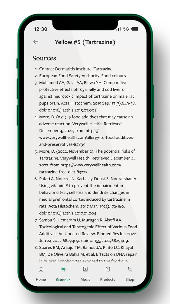
Provides good sources to backup claims
Cons:
Doesn’t offer much apart from beauty and personal care products
UI is kind of ugly
Features are hidden behind a paywall
think dirty
Pros:
Usability is nice
Provides nice ingredient breakdown per product
Allows for customer reviews and additional product submissions
Cons:
Mostly all features are hidden behind a paywall
Doesn’t provide many sources to backup product claims
Also only for personal care products
UI is ugly
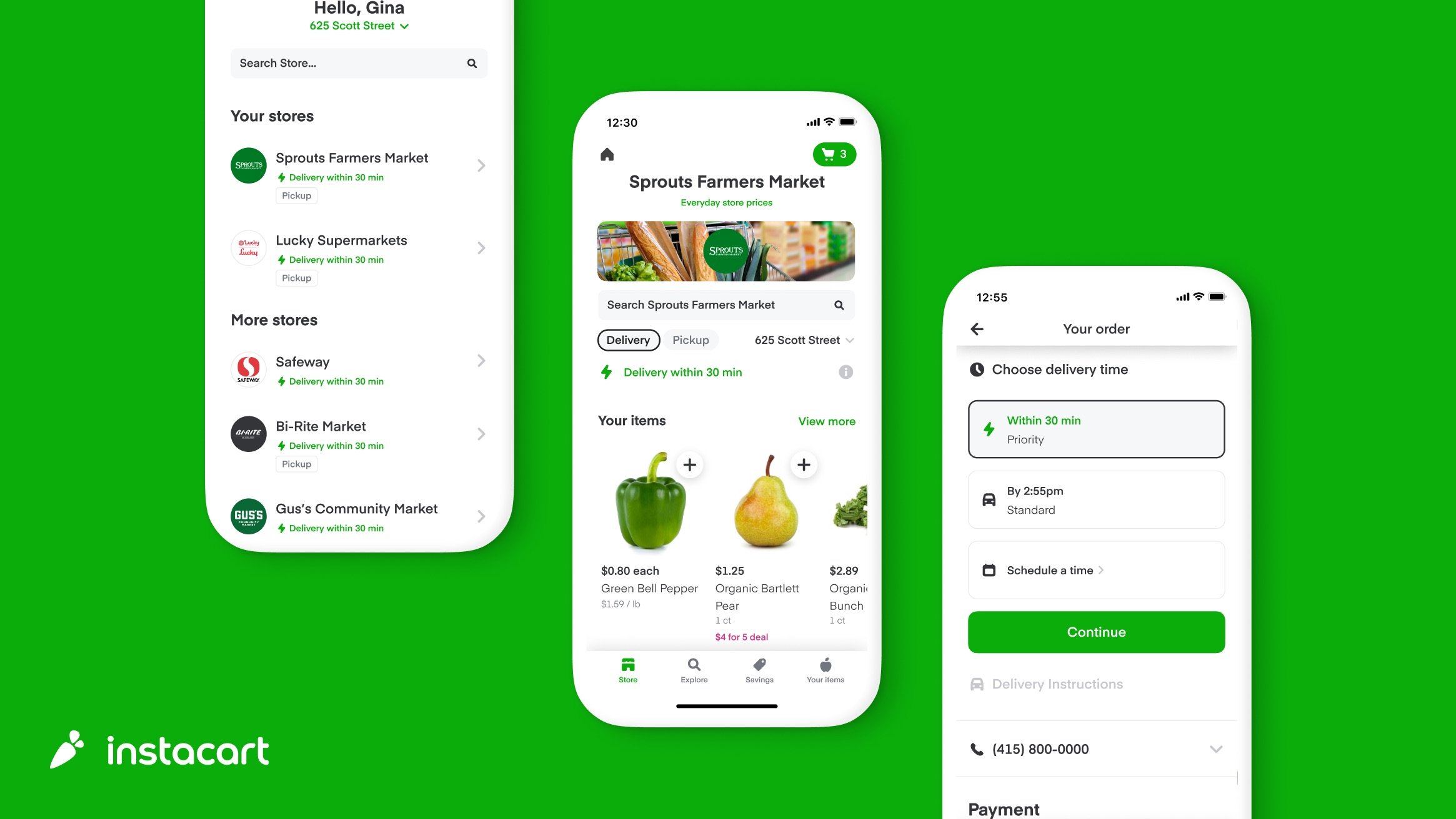
instacart
Pros:
Organization and usability is great
Allows users to order products near them and get them delivered
Provides some meal ideas
Organized like a traditional grocery store
Cons:
Not many to list
research takeaways
Quick Facts
A 2014 study showed that young adults with poor health literacy are unlikely to use food labels to select food products to buy while grocery shopping
A 2022 study showed that making specific health information easily available deeply influenced dining decisions
78% of food consumers said they encounter conflicting information about what foods are good to eat.
A 2012 study showed that race and parental status were huge indicators in poor food literacy among SNAP users.
13.5 million households in the US experienced food insecurity at some time during 2021
5.1 million US households experienced low food security, meaning at least one member in the household had to skip meals or their food intake was severely reduced
More than 40% of the US population live more than one mile from a grocery store.
Rural communities, and black and latinx communities experienced the most food insecurity
Common Bad Ingredients
Sodium Nitrite and Sodium Nitrate
Partially and Fully Hydrogenated Vegetable Oil
Yellow #5 and Yellow #6
BHA and BHT
Blue #1 and Blue #2
Sodium Phosphate
Corn Syrup
Interesterified Fat
Red #3 and Red #40
Aspartame
Caramel coloring
Evaporated Cane Juice
Monosodium Glutamate
Hydrolyzed Vegetable Protein
High-Fructose Corn Syrup
Modified food starch
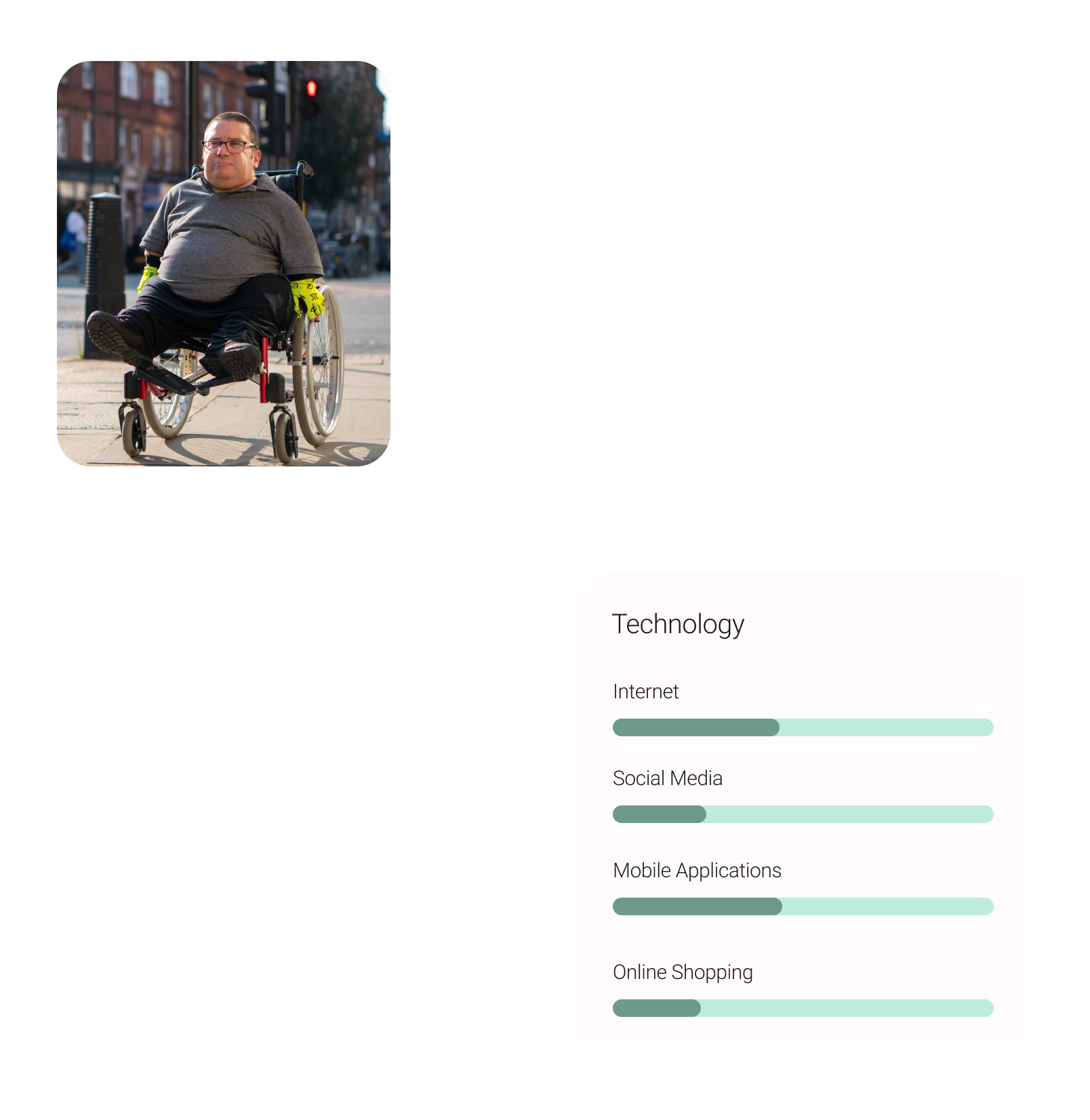
user personas
ideation
user flows
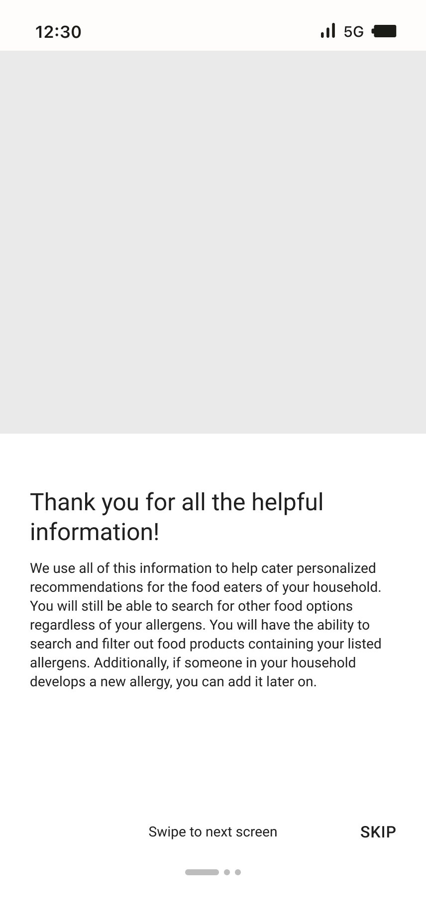
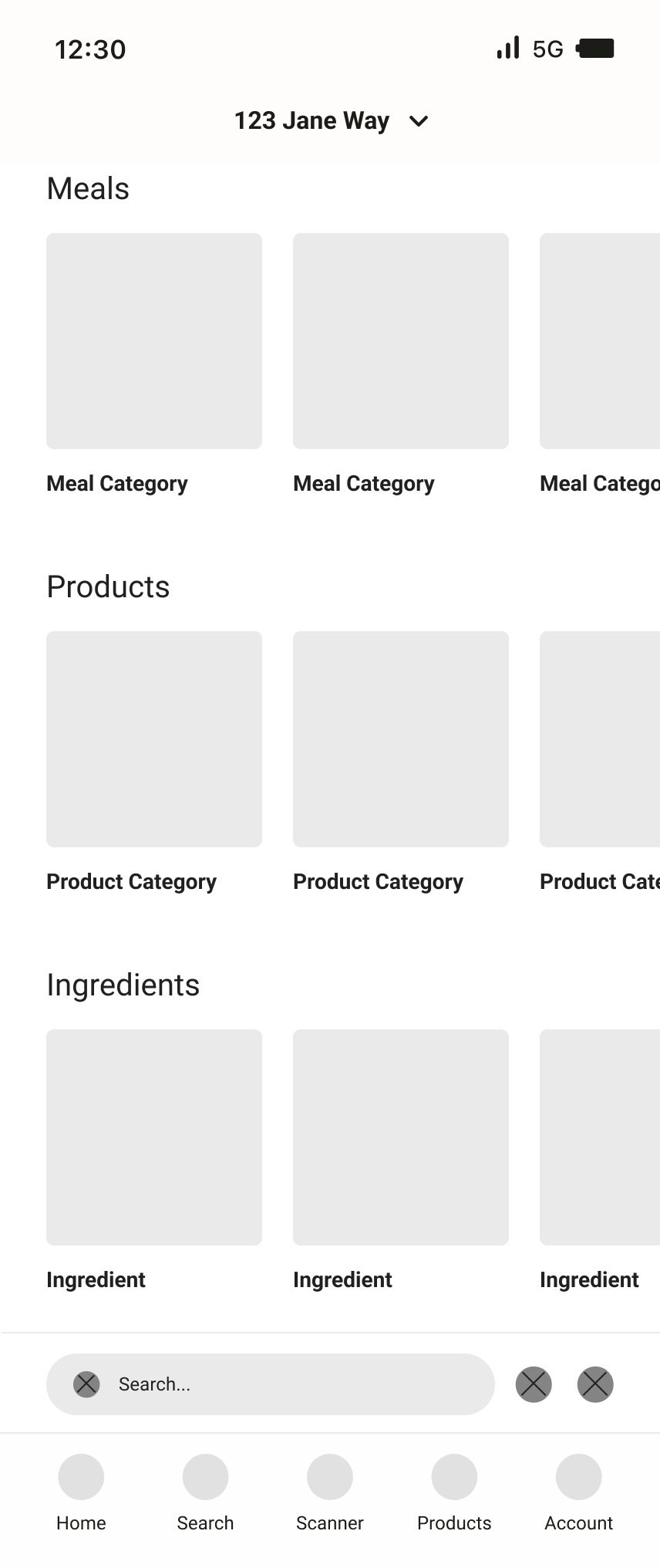
wireframes
branding
Color
I wanted the color to represent food-like colors, but I also needed a plethora of colors to use in order to help categorize the products. I landed on colors that reminded me of vegetables more specifically. Red and yellow are also known to psychologically induce feelings of hunger, so making sure to incorporate that knowledge into the branding was very important.
Typography
For typography, I chose Freight Text as a the primary header typeface and Freight Sans as the subheader and body typeface. Both of these are also used in the logo. I chose these typefaces because I wanted something that felt sophisticated yet friendly and easy to read. I wanted the type to enhance the overall branding but also not be too distracting
design
component library
