Feb 2023
planty
ux/ui design | product design | brandingVideo walkthrough of the app!
About The Project
Planty is a plant care app that provides customized plant care routines and plant care services for when you're away from home. I got the idea for this app when I went on vacation and returned home to multiple dead plants that suffered immensely due to a heating issue in my apartment. This issue caused me to lose hundreds of dollars in plants that I tended to for years. I was absolutely heartbroken. I realized in this moment that I would have benefitted from a plant care app that provided some plant caretakers that could come to my house while I was away to check on my plants. Having someone there during my vacation to water my plants would've not only saved them, but would have saved me hundreds of dollars.
Project outline
Problem: Plant enthusiasts struggle to go on vacation or leave home for an extended period of time because of the fear their plants will die while they’re away. Additionally, plant enthusiasts struggle to manage taking care of their plants due to having minimal plant experience or too many plants to remember to care for.
Solution: Create an app that allows plant enthusiasts to connect with plant caretakers in a safe way to set up arrangements for plant care that will occur while they are away from home. This problem can also be solved by creating an app that provides customized plant care routines specific to plants and sites (rooms or areas) that can also be used to streamline the job listing process.
Audience: Plant enthusiasts of all experience levels and those who have plants that like to go on vacation or are in need plant care related services.
my process
research & discovery
competitive analysis
Planta
Pros:
Creates personalized watering schedule
Onboarding process assesses skill level with plants
Has sites as hosts for plants
Task list on homepage
Easy usability
Cons:
Most important features hidden behind paywall
Doesn’t offer much in tracking plant progress, such as new leaves, harvests, pictures, blooming, etc.
care.com
Pros:
Able to find a sitter for your children relatively easily using job posting type style where you post what you pay and sitters can apply to the position.
Provides background checks
Allows sitters to have set availability
Allows one-time and recurring jobs
Provides babysitting, senior care, housekeeping, pet care, and more
Cons:
Messaging system isn’t good, most conversations through platform move over to iMessage
Notifications center is confusing to navigate. Notifications are inside messaging center
Doesn’t let you have more than one application template
wag!
Pros:
Love the in depth onboarding process. Asked a lot of good questions about pets
Provide caregiver preferences
Not hard to find caregivers. Doesn’t require a lot of communication between the two
Easy usability
Cons:
I wish caregiver search was easier to use
I wish that they didn’t make you pay before finding a caregiver
I think there should be a booking confirmation thing and then require you to pay after that
user personas
ideation
branding
Color
For color, I wanted the branding to resemble the colors of nature and beautiful plants in the wild. Green is a signature color that lives in every single plant, and I made sure to make it a warm toned green so it was friendly and inviting. The blue is representative of the sky, and orange represents the warmth of the sun. Purple is a common flower color, so I included that as an additional accent color. Red is representative of the error states and stands out from other colors. Everything is primarily in a dark color scheme because I knew that trying to design for a dark theme would be more of a challenge for me, but I also thought it enhanced the vibrancy of the colors.
Typography
Considering I wanted this brand to be very friendly, warm, and inviting, I decided to choose type that resembled those feelings as well. The main headline type is P22 Mackinac Pro designed by Mike Beens of P22 Type Foundry. The secondary font utilized for subheaders, body type, and labels is Gibson by Jamie Chang, Kevin King, Patrick Griffin, and Rod McDonald from Canada Type. P22 Mackinac Pro is a very rounded serif font that is bubbly and inviting. Gibson has a similar x-height and type features so it made sense to use it to compliment the header.
user flows
wireframes
design
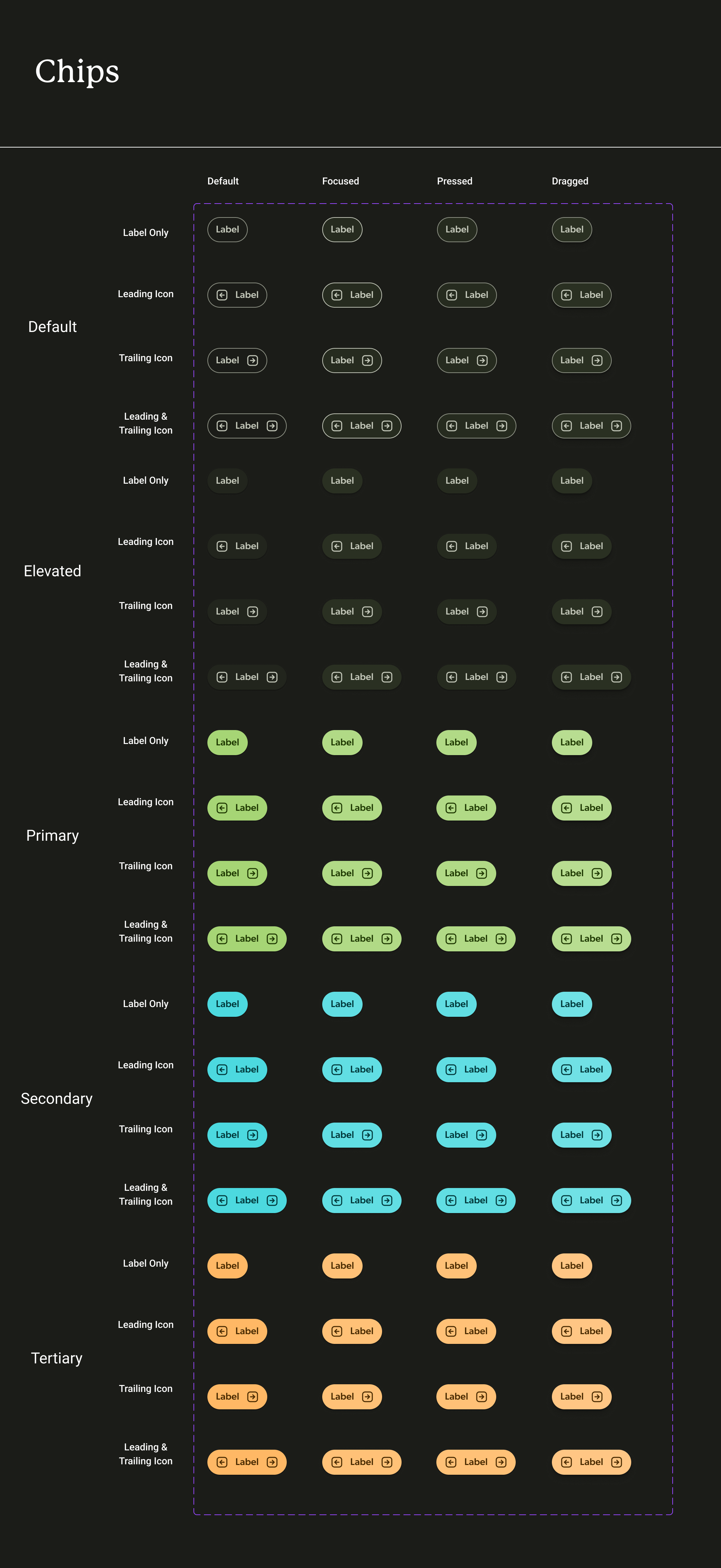
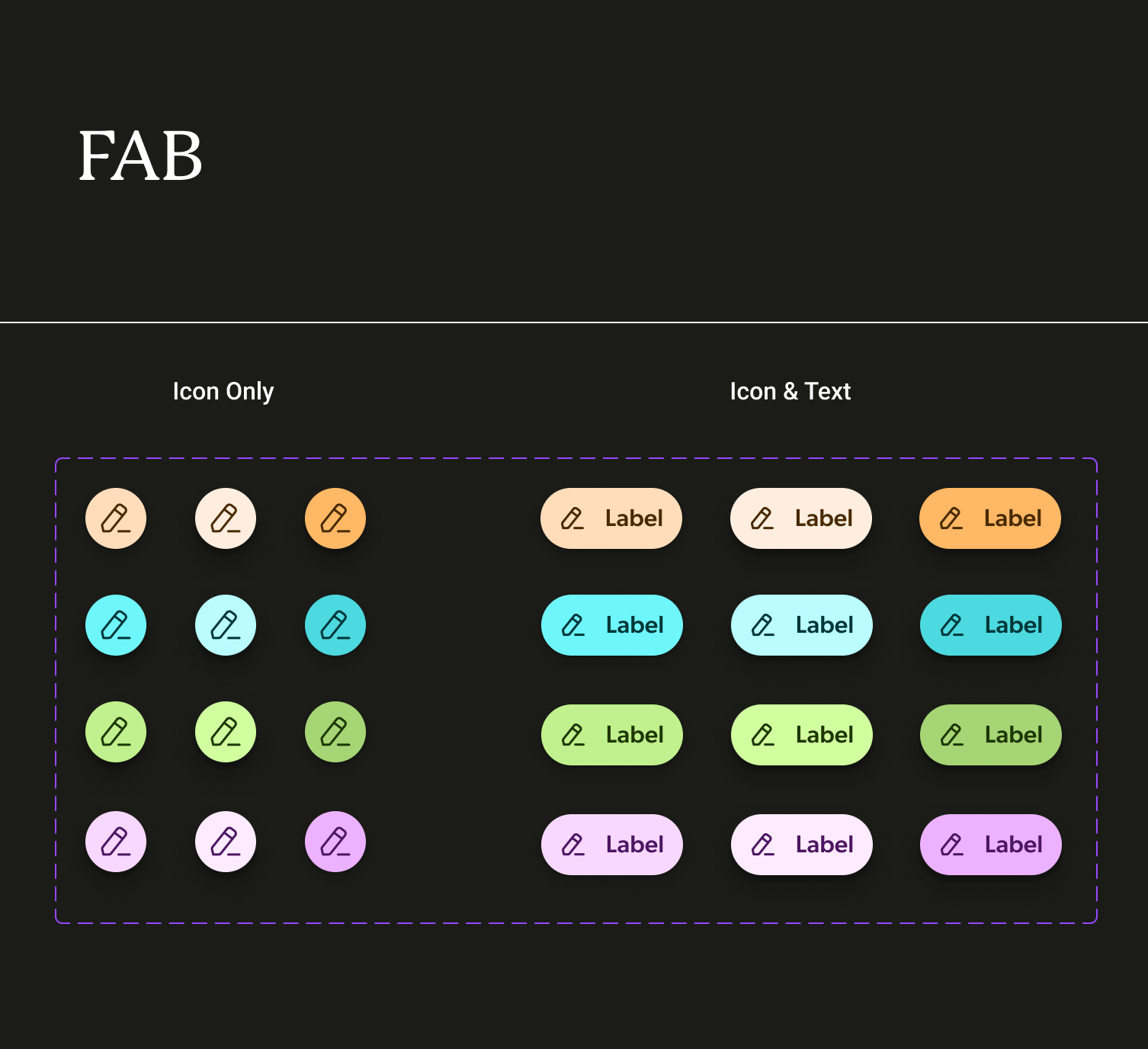
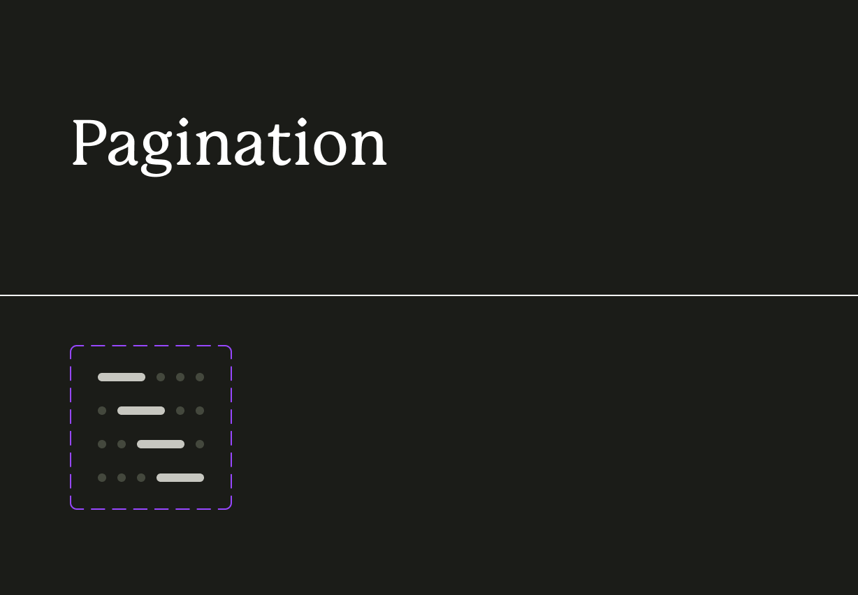
component library
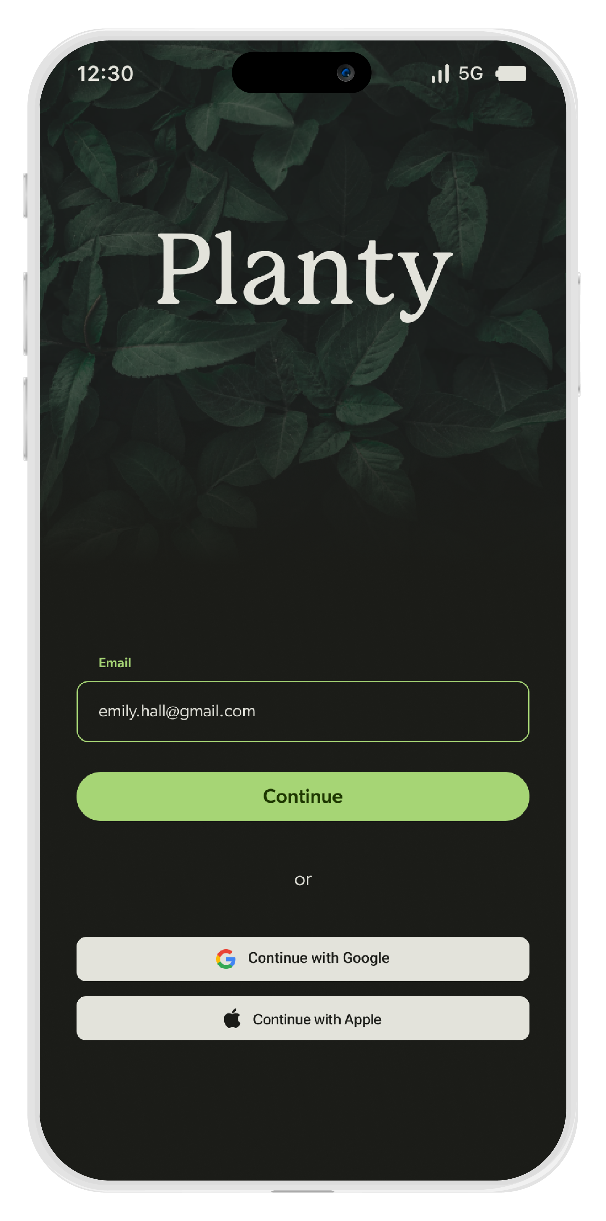
Planty Login Page

Onboarding
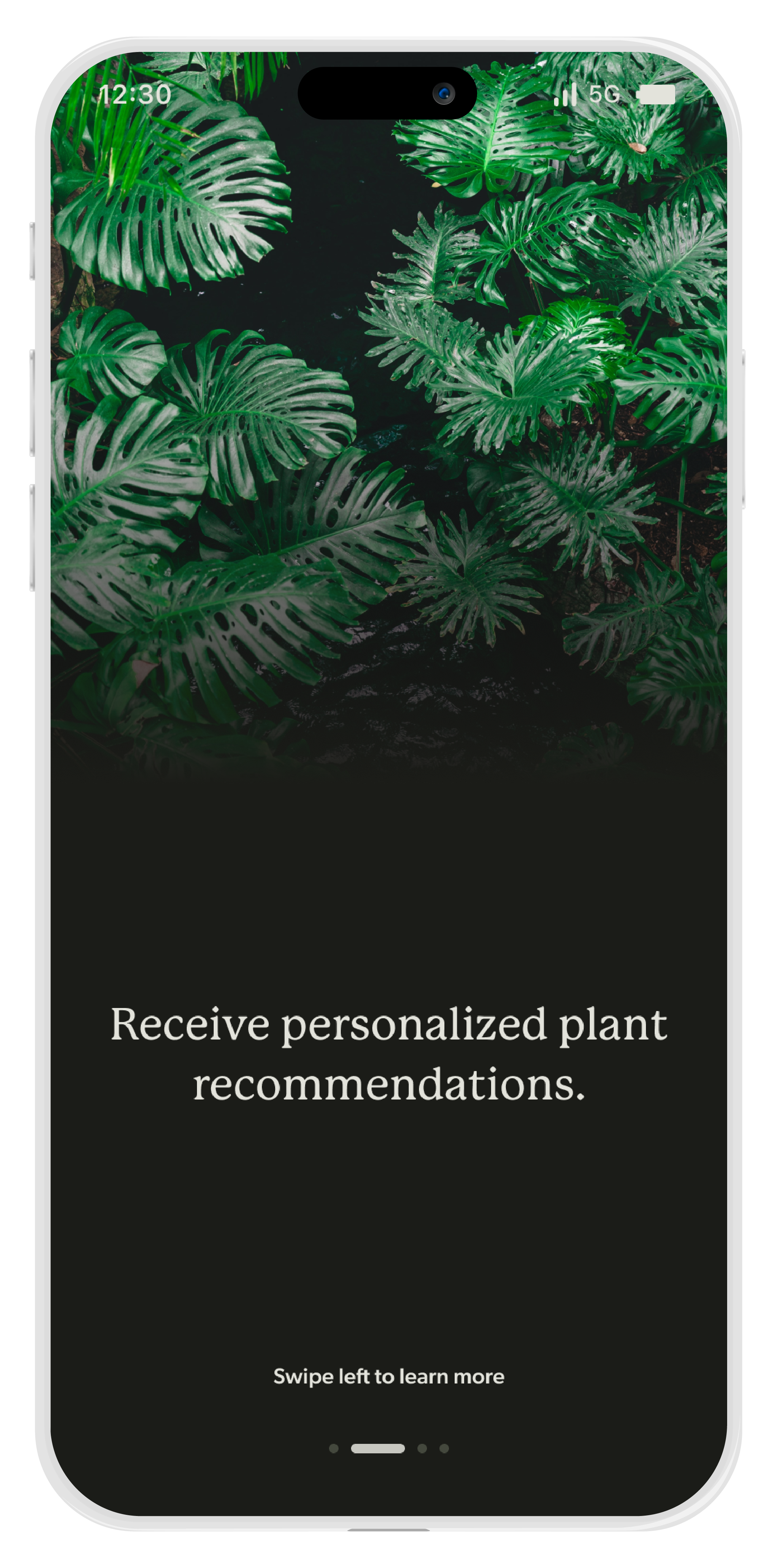
Onboarding
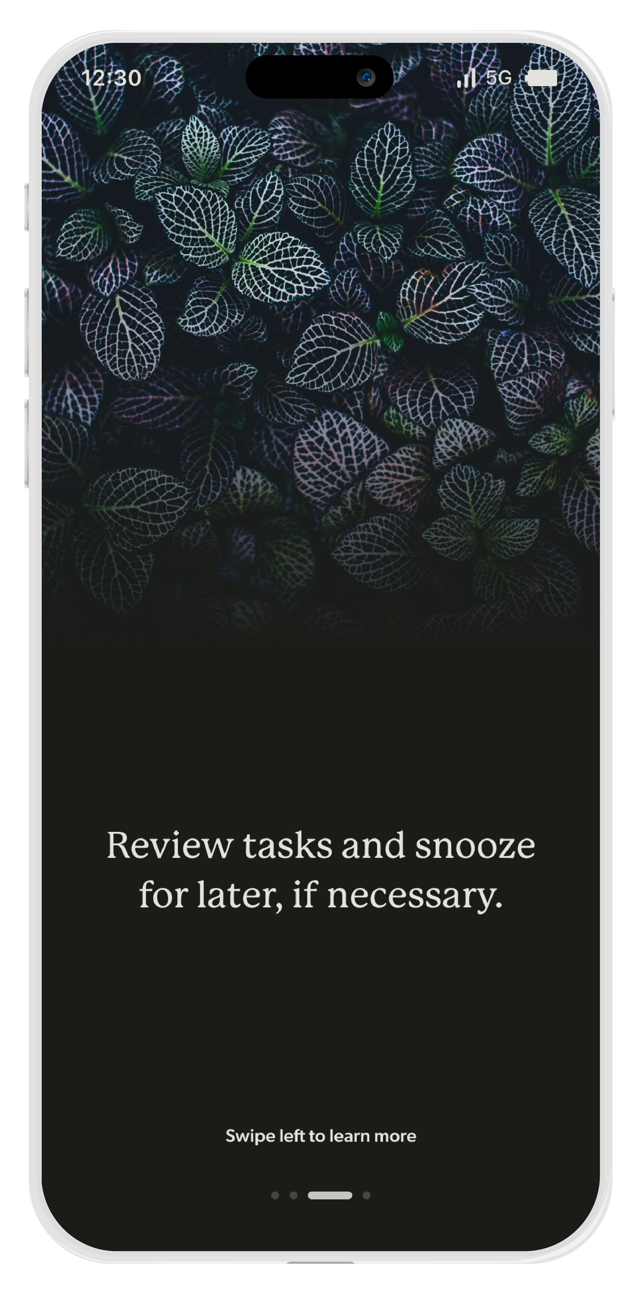
Onboarding

Onboarding
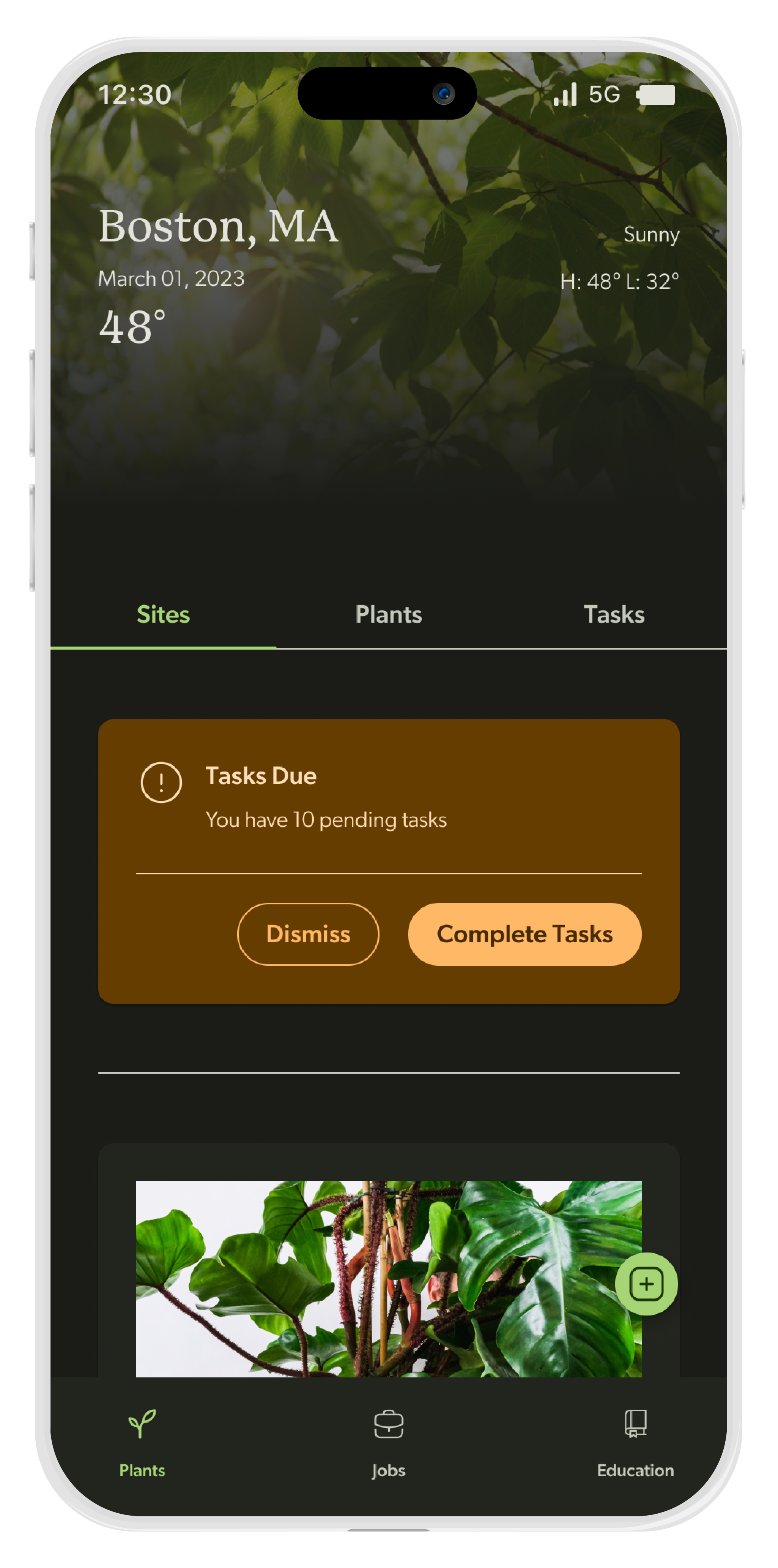
Planty Home Page
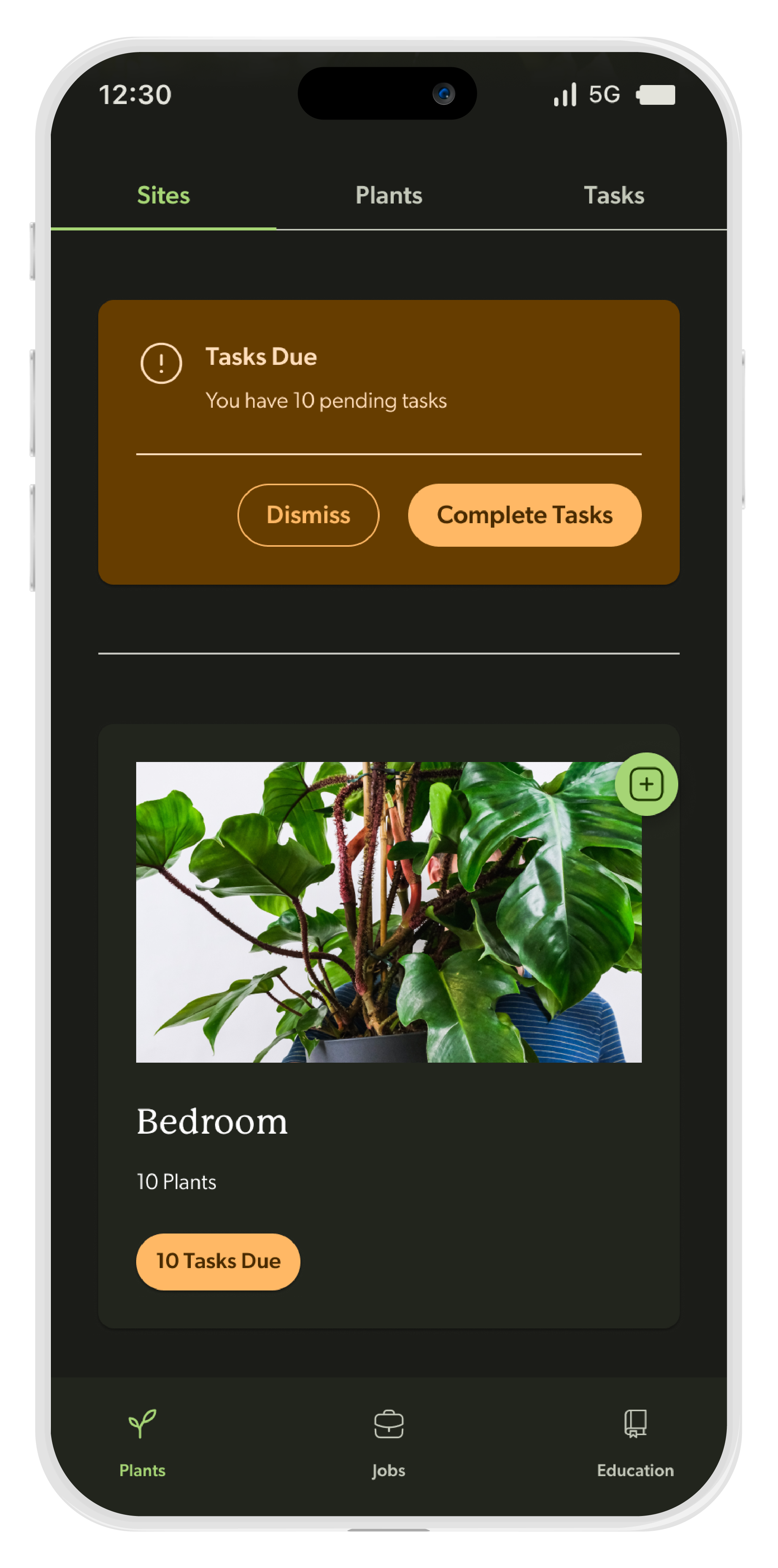
Home Page - Sites
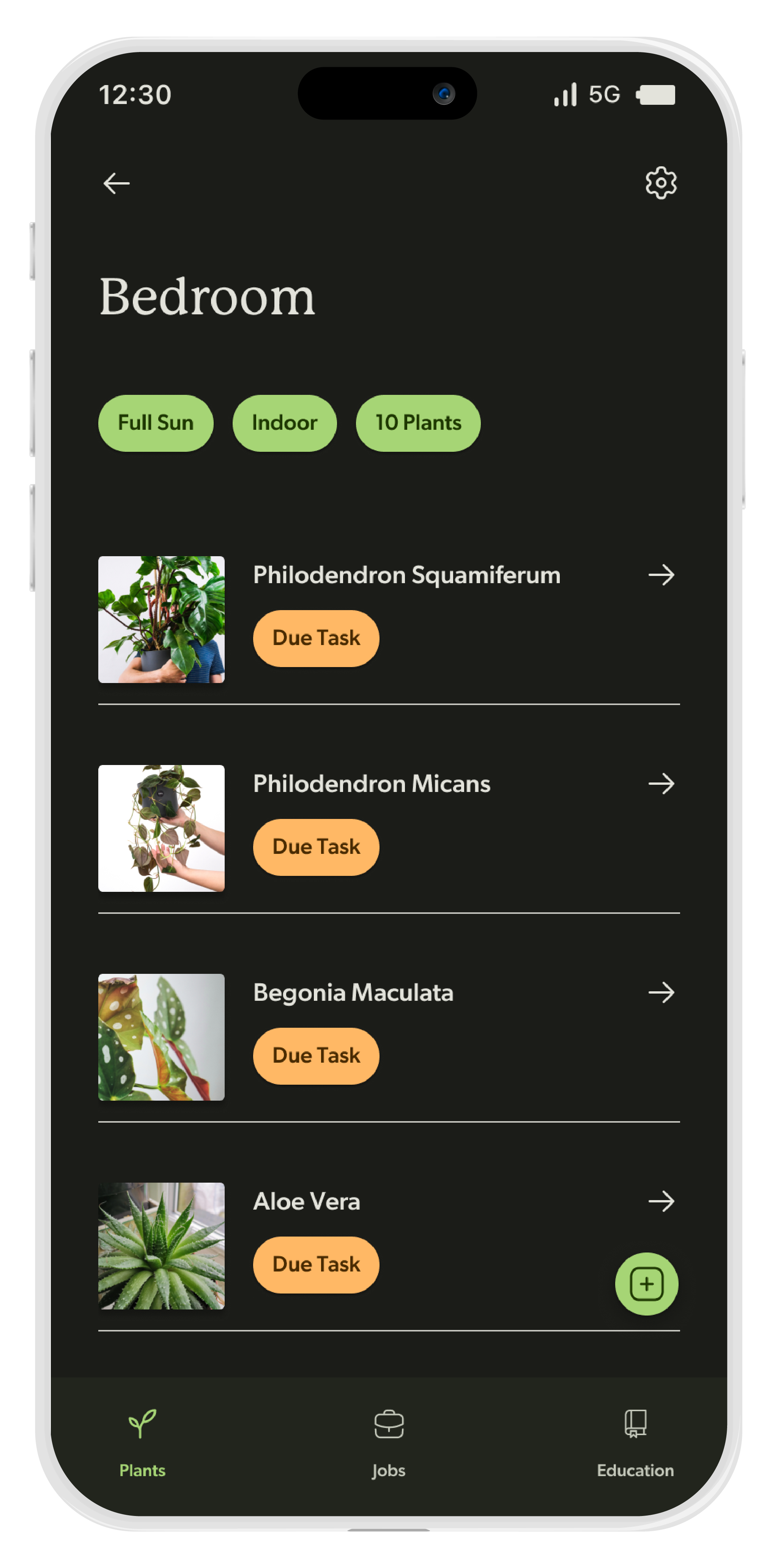
Bedroom Site
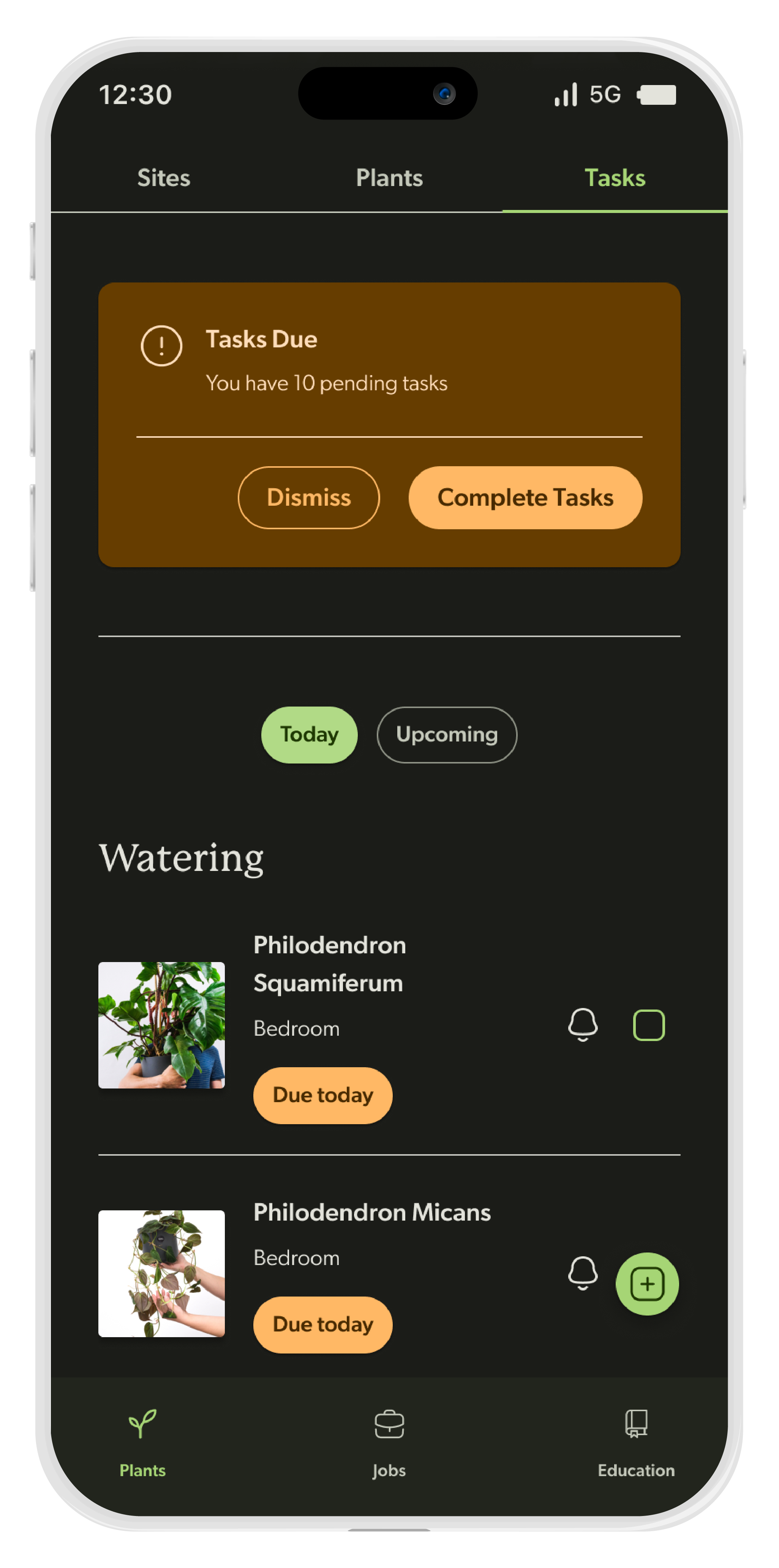
Home Page - Today's Tasks

Home Page - Completing Tasks

Home Page - Action selection
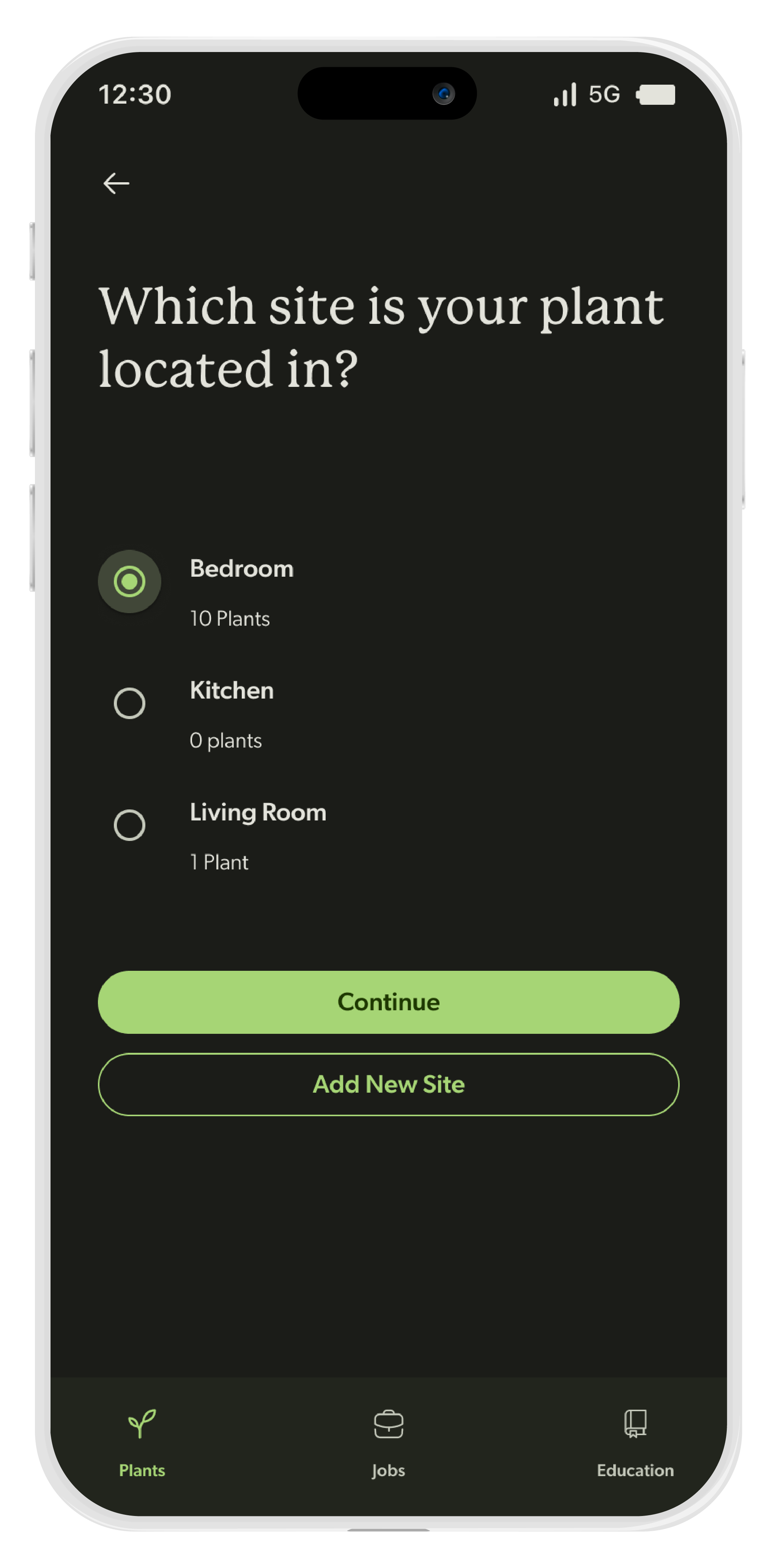
Adding Plants

Adding Plants
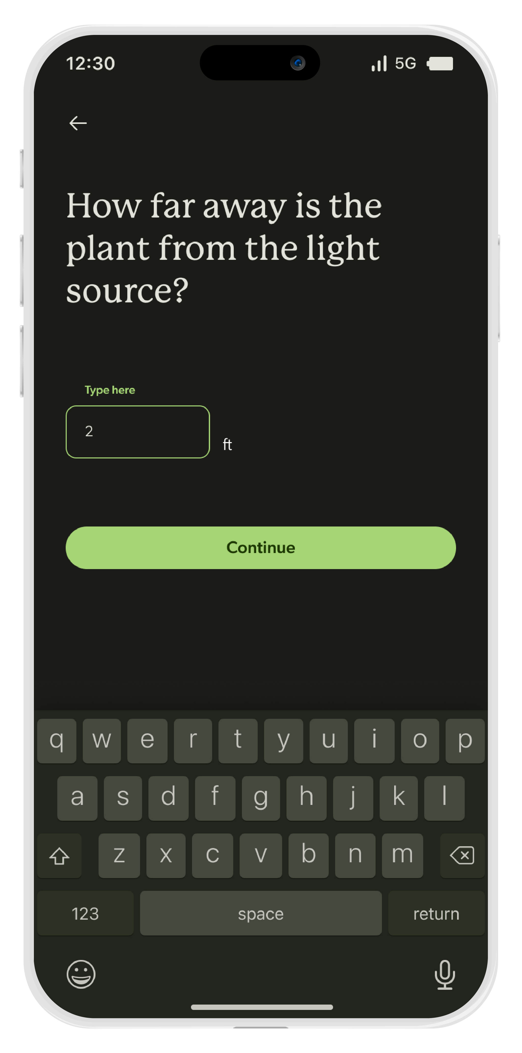
Adding Plants
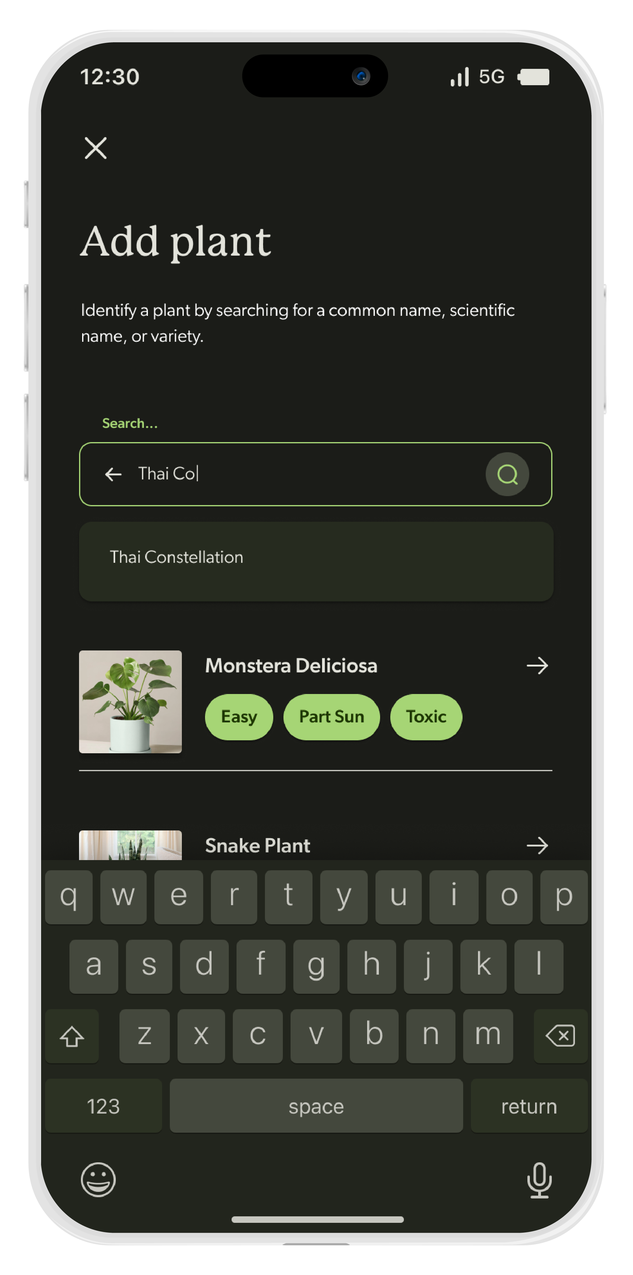
Adding Plants

Adding Plants

Adding Plants
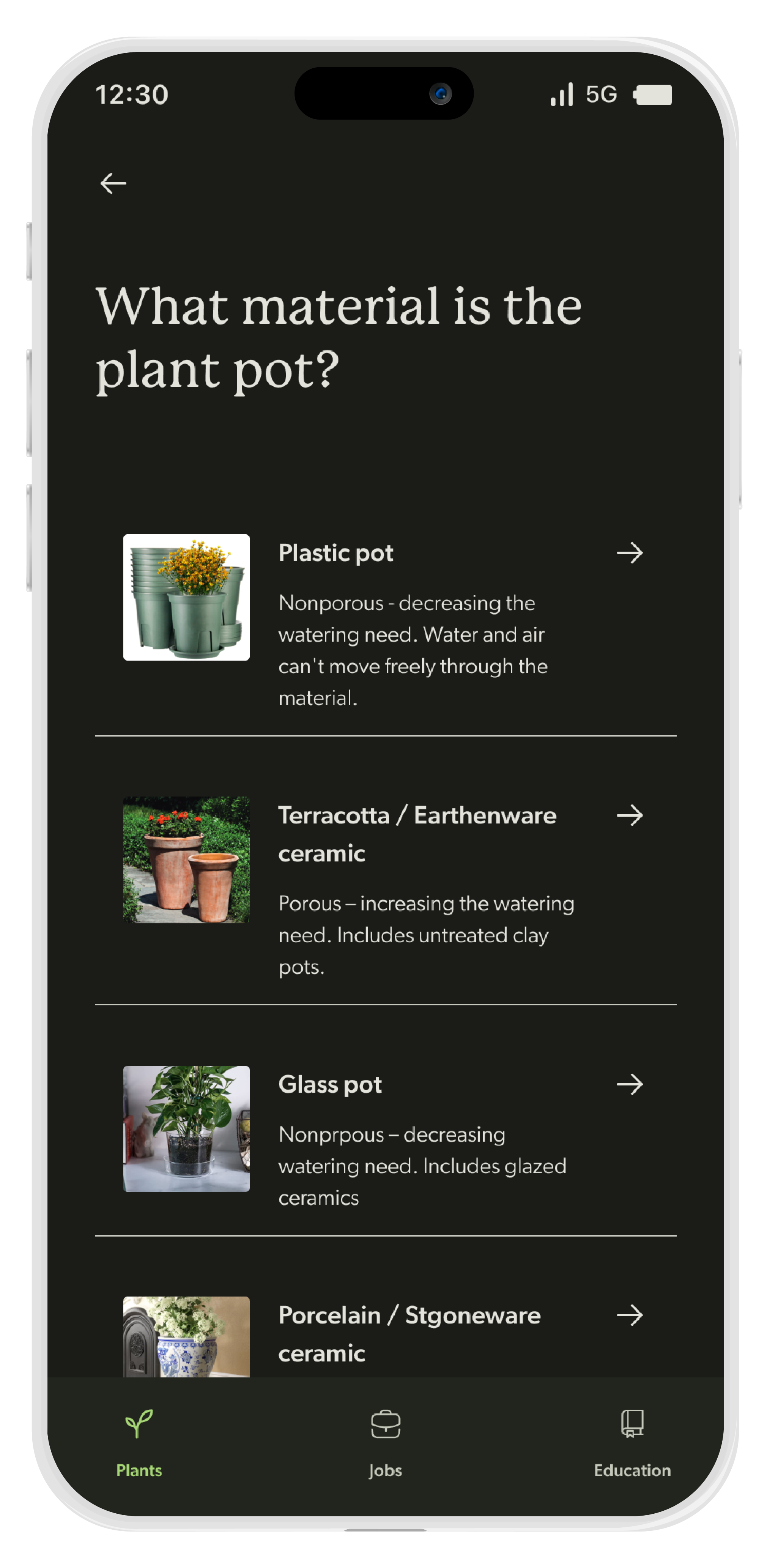
Adding Plants
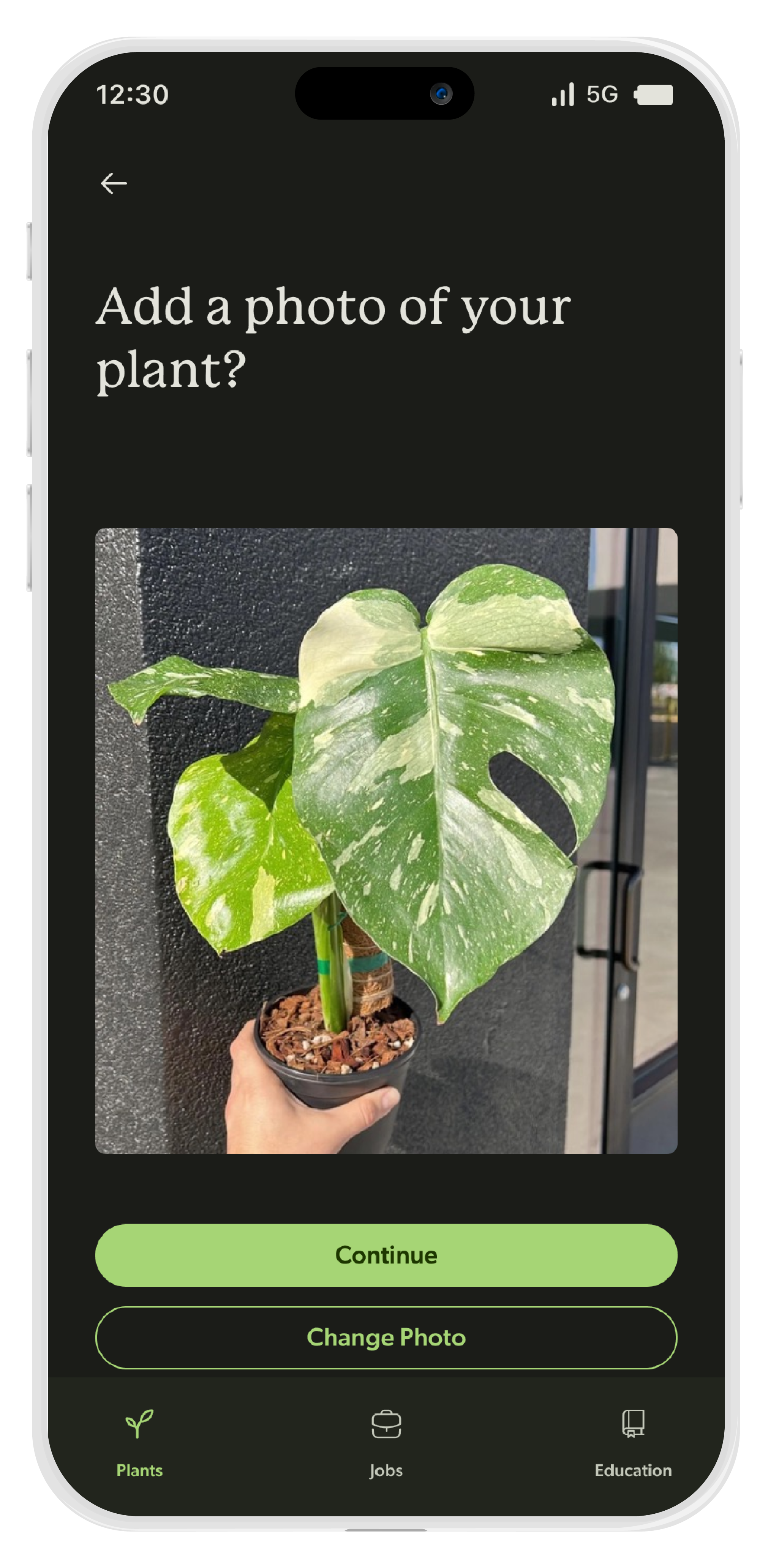
Adding Plants

Adding Plants

Adding Plants

Adding A Site

Adding A Site
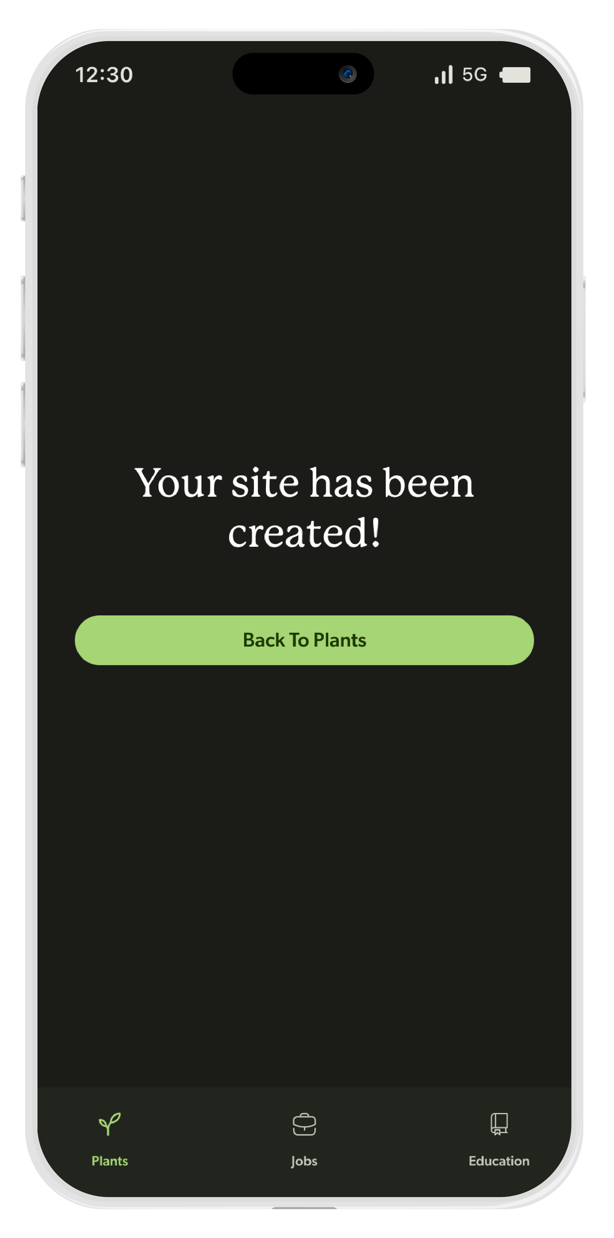
Adding A Site
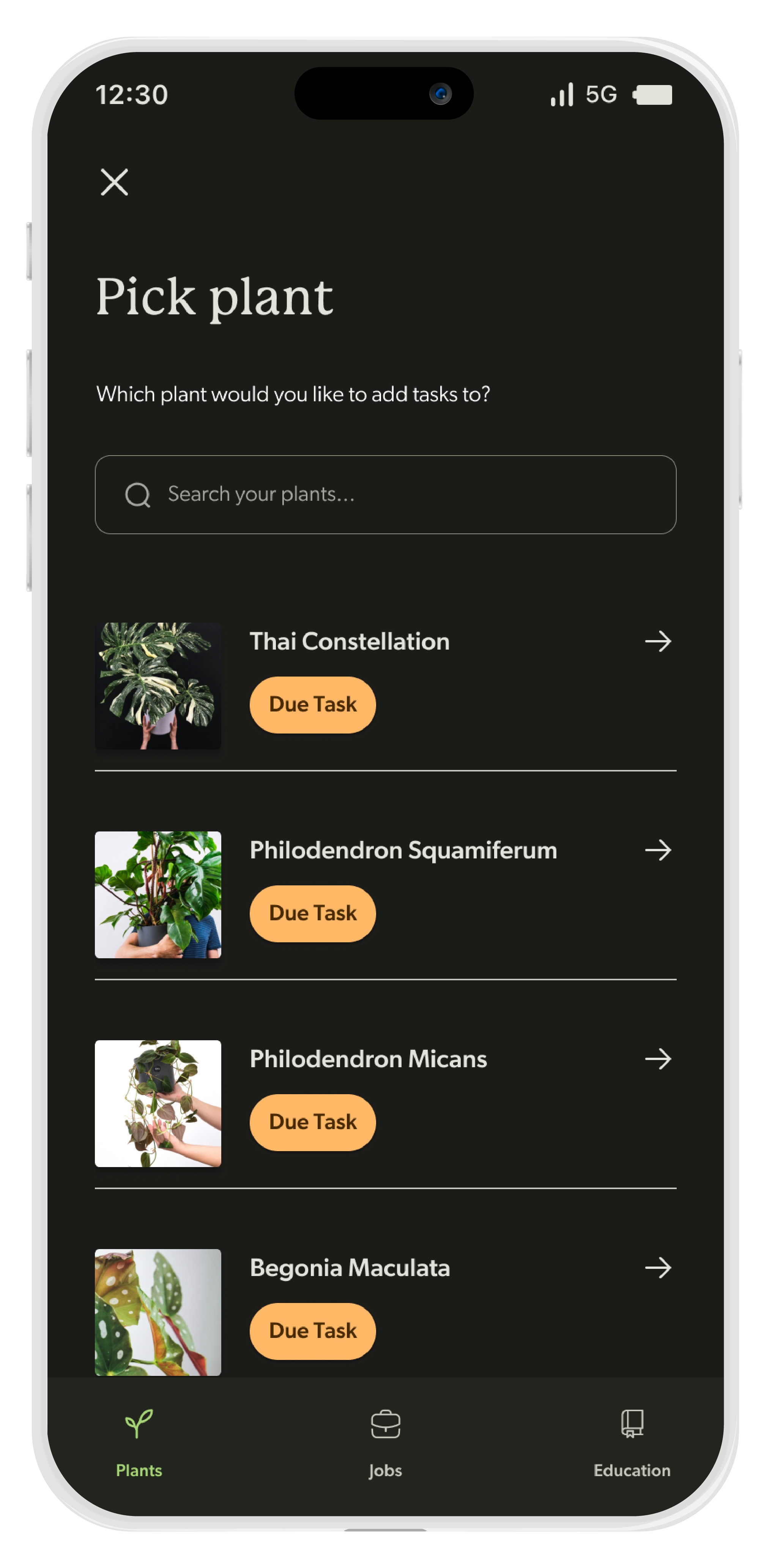
Assigning a Task to a Plant

Assigning a Task to a Plant

Assigning a Task to a Plant

Assigning a Task to a Plant
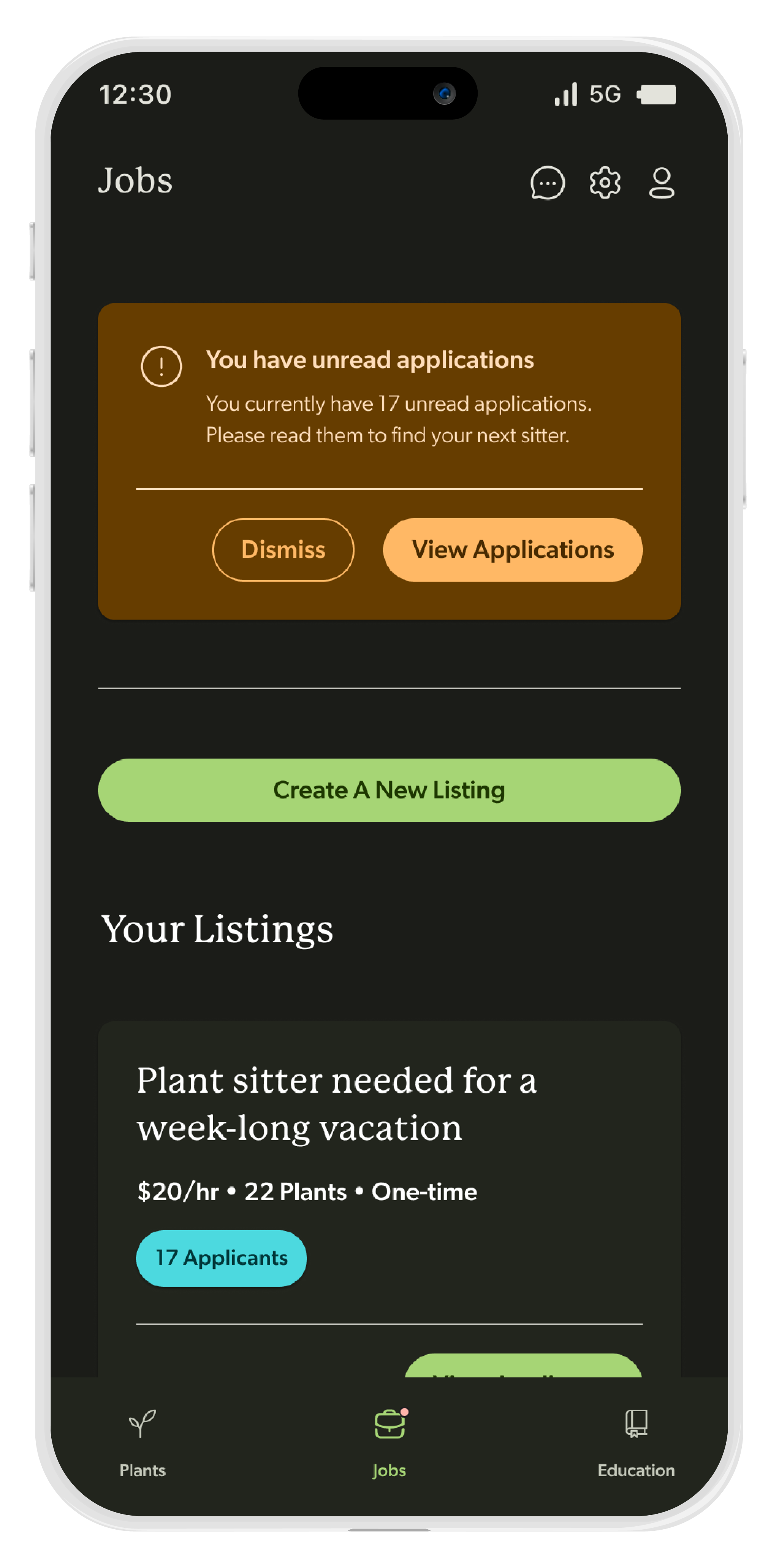
Jobs Page - Lister View
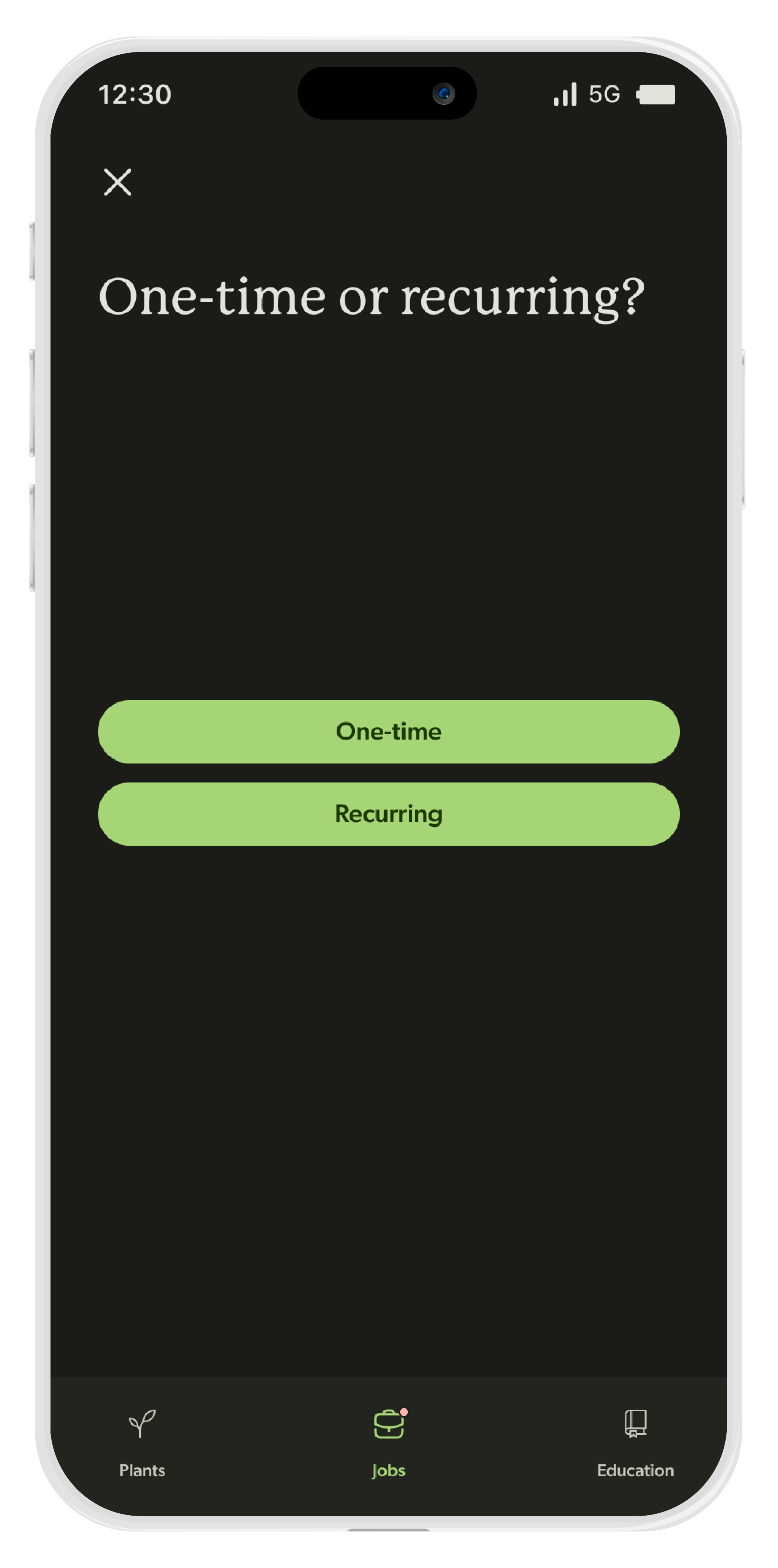
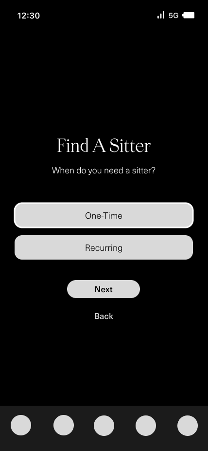
Creating a Job Listing

Creating a Job Listing

Creating a Job Listing
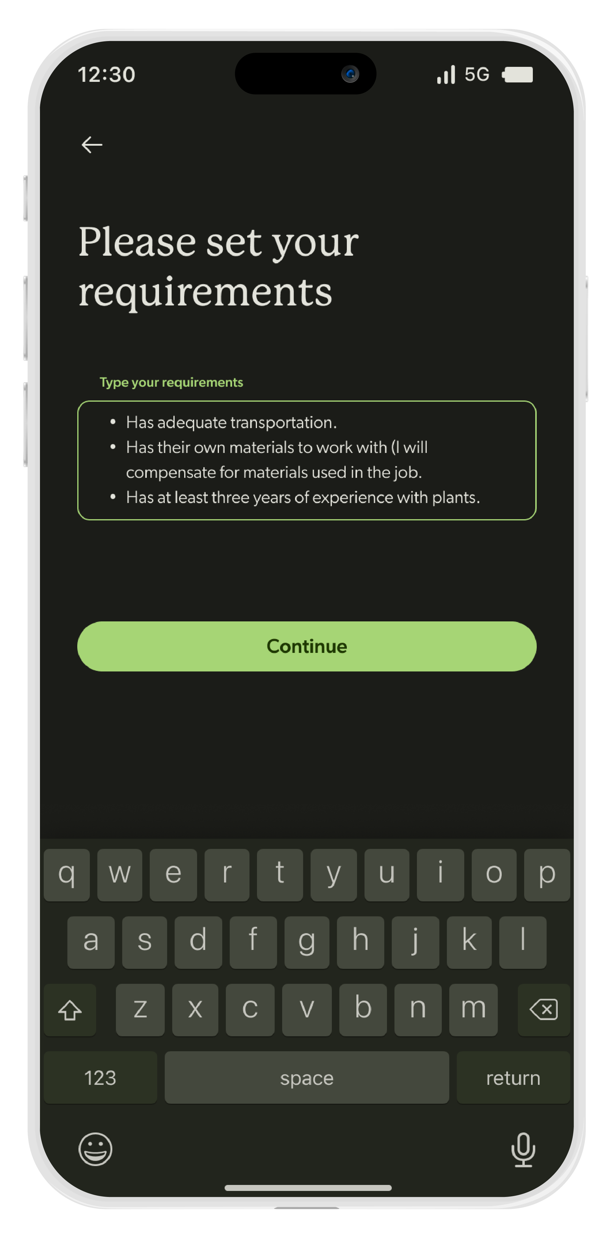
Creating a Job Listing
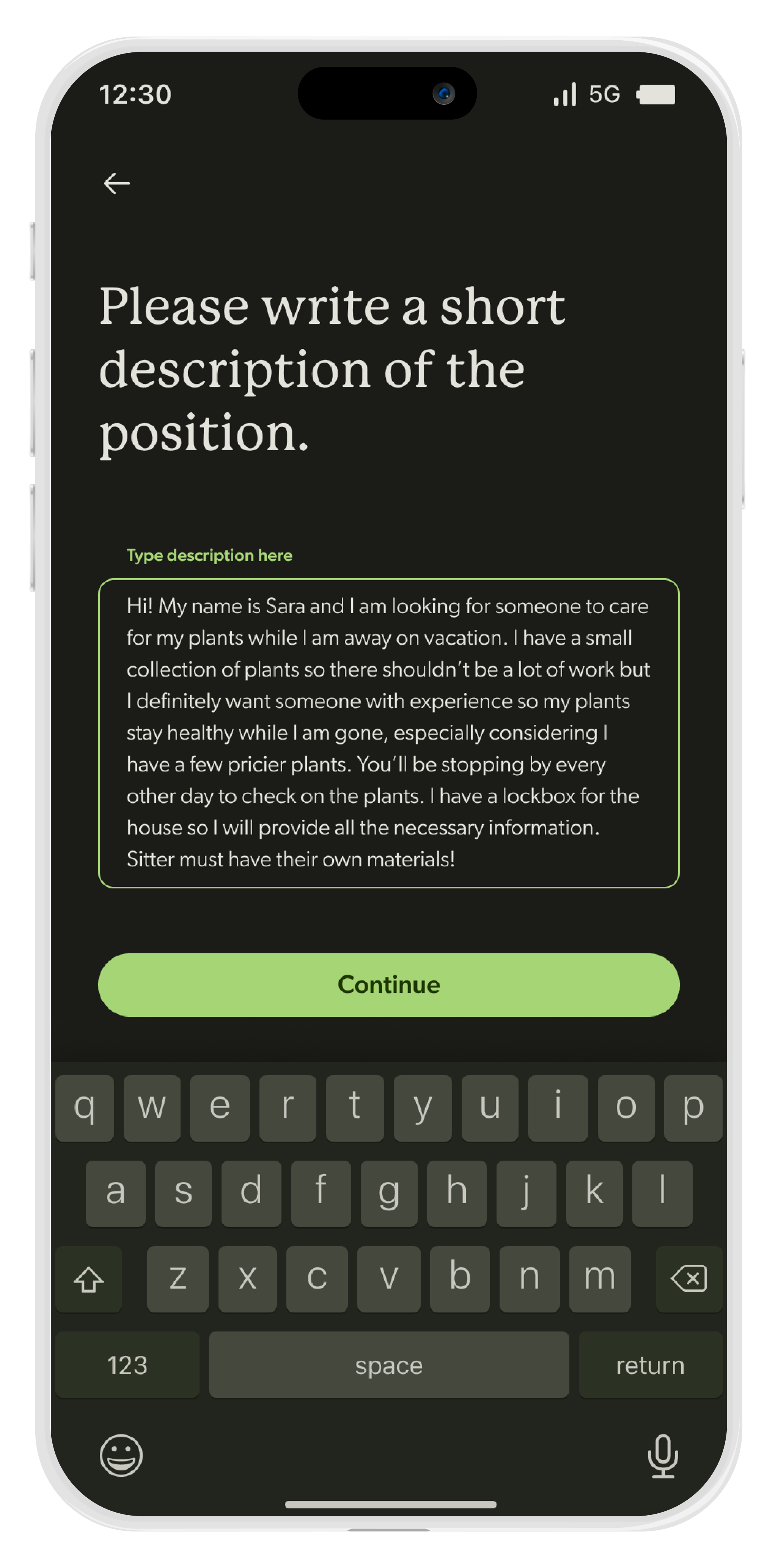
Creating a Job Listing

Creating a Job Listing
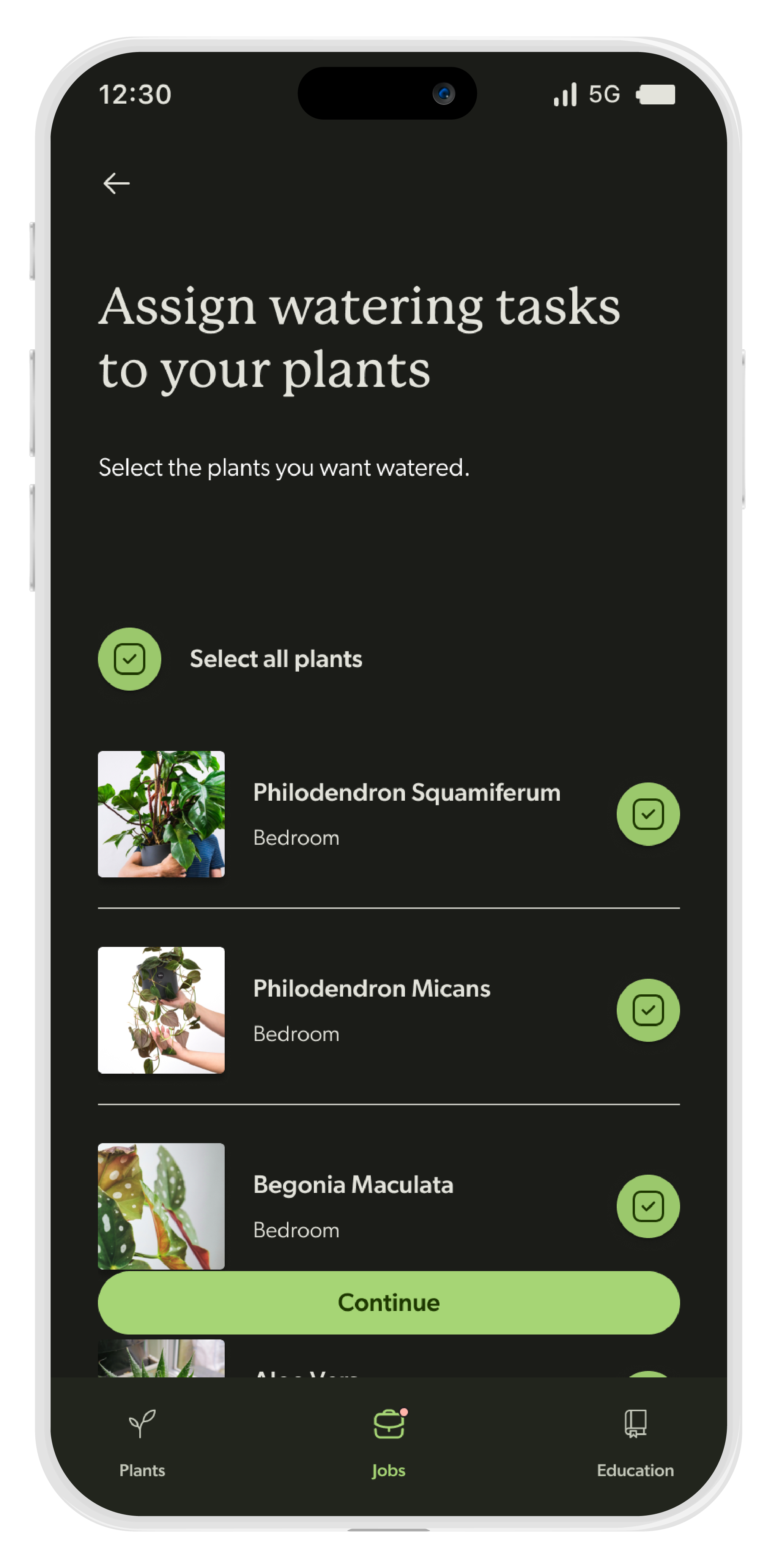
Creating a Job Listing
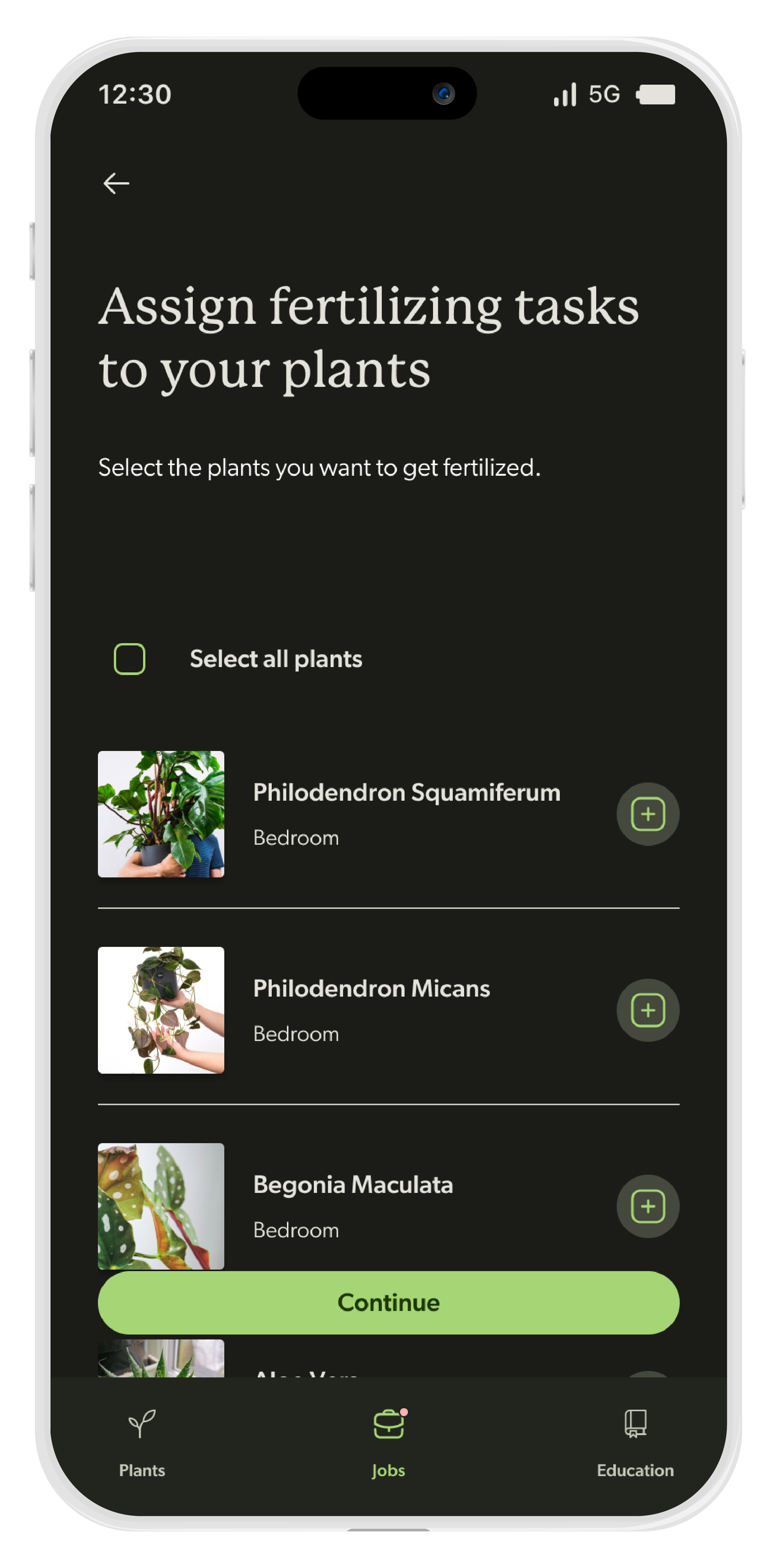
Creating a Job Listing

Creating a Job Listing

Creating a Job Listing
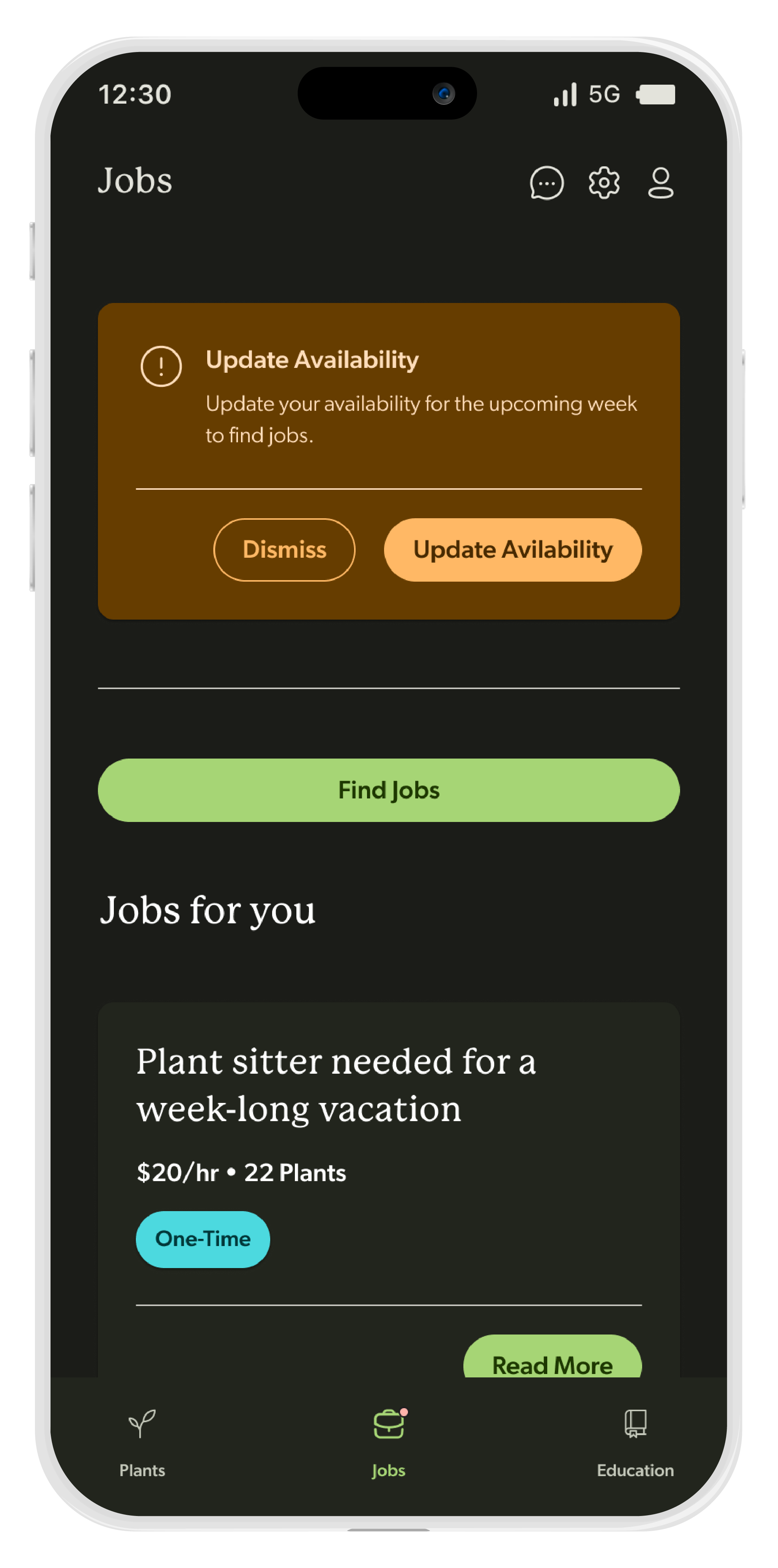
Jobs Page - Caretaker View

Jobs Listing Page

Applying to Jobs

Applying to Jobs
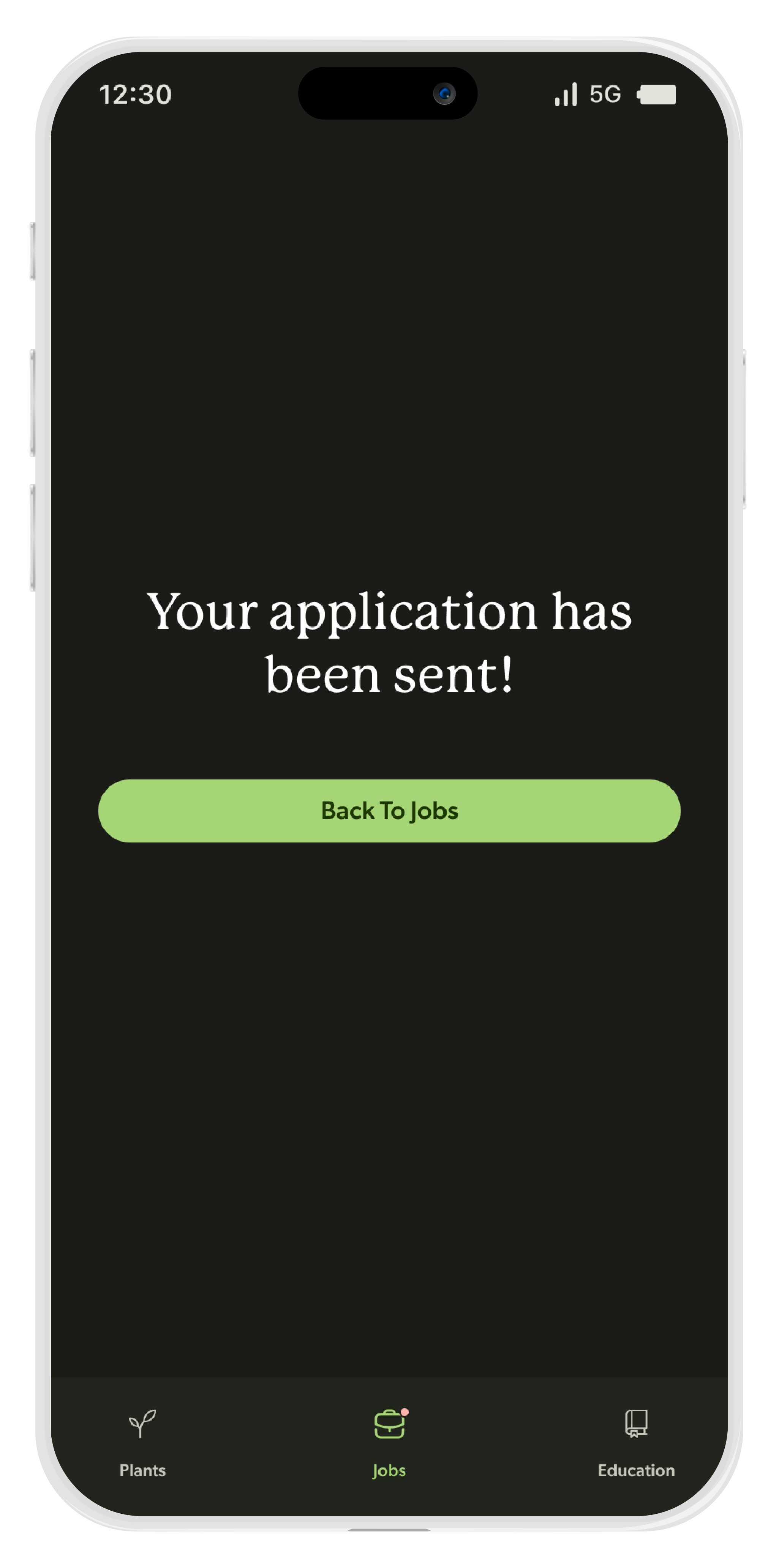
Applying to Jobs

Education Page
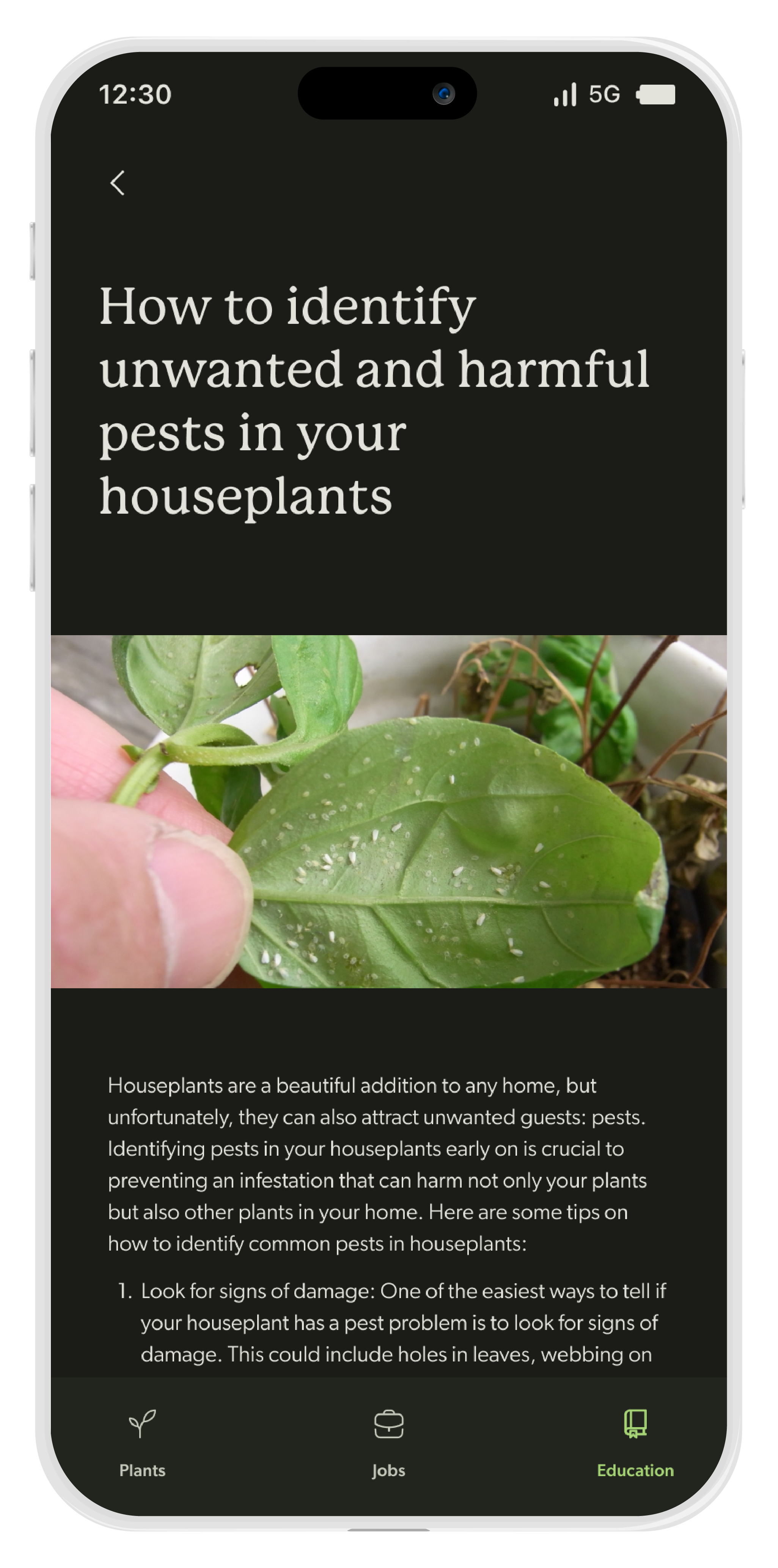
Educational Article
testing
User Testing
The overall feedback from user testing was pretty positive. The users generally liked the UI and branding of the app and thought it made sense for the purpose of the app. There were some minor prototyping errors that needed to be fixed which I discovered from user testing. But overall the feedback was positive and they found Planty to generally be easy to use.
“The design is very accurate to how a plant app should look. It’s clear what the app is for and the images don’t overpower the text at all”
anonymous user from usertesting.com
“The navigation is very easy to use and it’s easy to understand where I am”
anonymous user from usertesting.com
“The only thing I’d say about the process of creating a listing is that the questions should be ordered a bit differently.”
anonymous user from usertesting.com
“The process of creating a listing is very easy and asks a lot of really relevant questions”
anonymous user from usertesting.com


